AURAÉ: Skincare Brand and Packaging
A skincare brand concept balancing clinical clarity with warmer shelf presence through a matte-black identity, bold SKU colours, and sustainability cues.
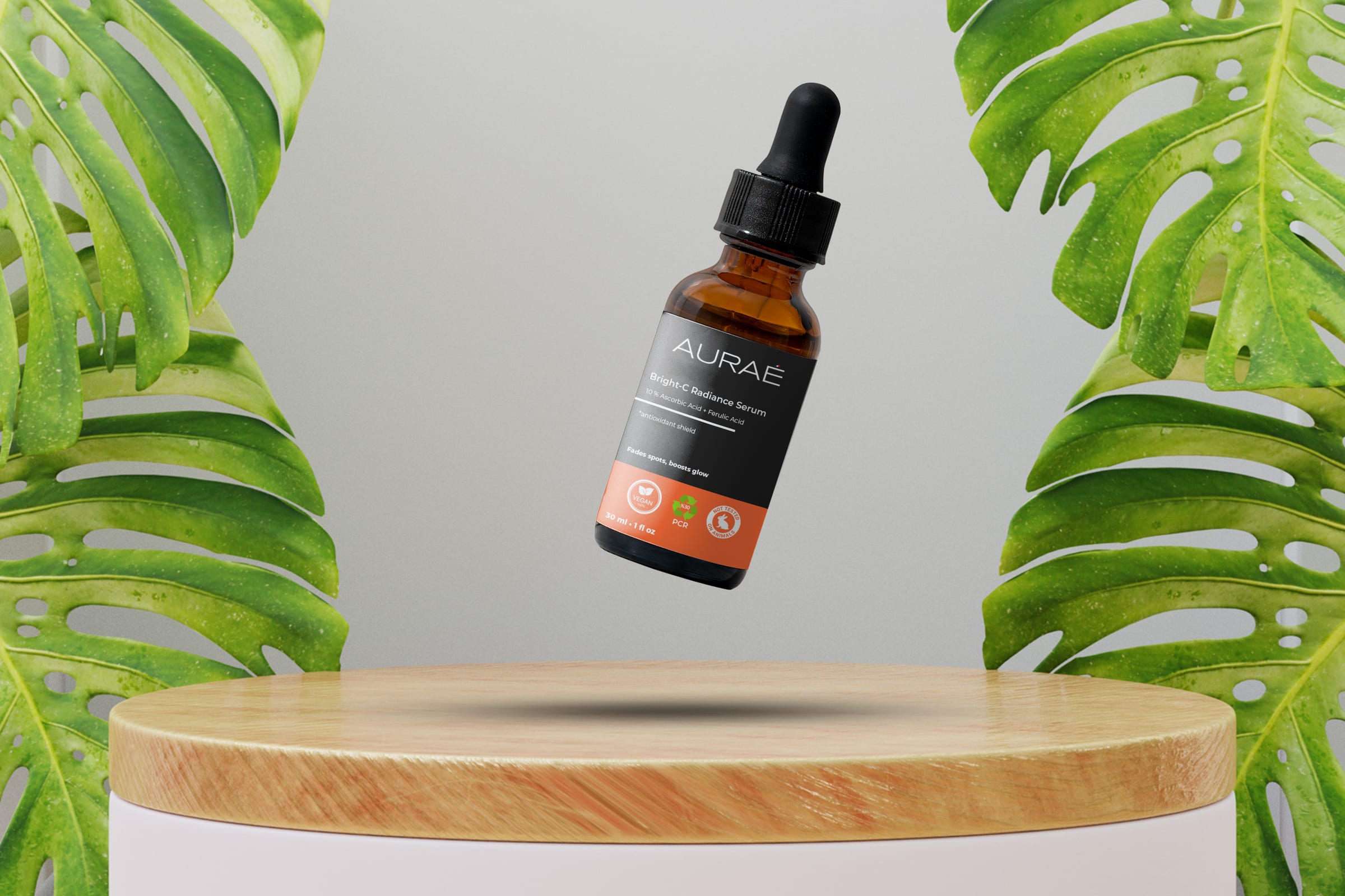
AURAÉ is a skincare brand and packaging concept built around the line "Gentle care, clear skin." The project started from a market gap between clinical minimalism and playful pastel skincare. I shaped the brand as calm, ingredient-savvy and inclusive, with packaging that makes active ingredients, product benefits and low-impact material claims easy to read at shelf distance.
Brand Core
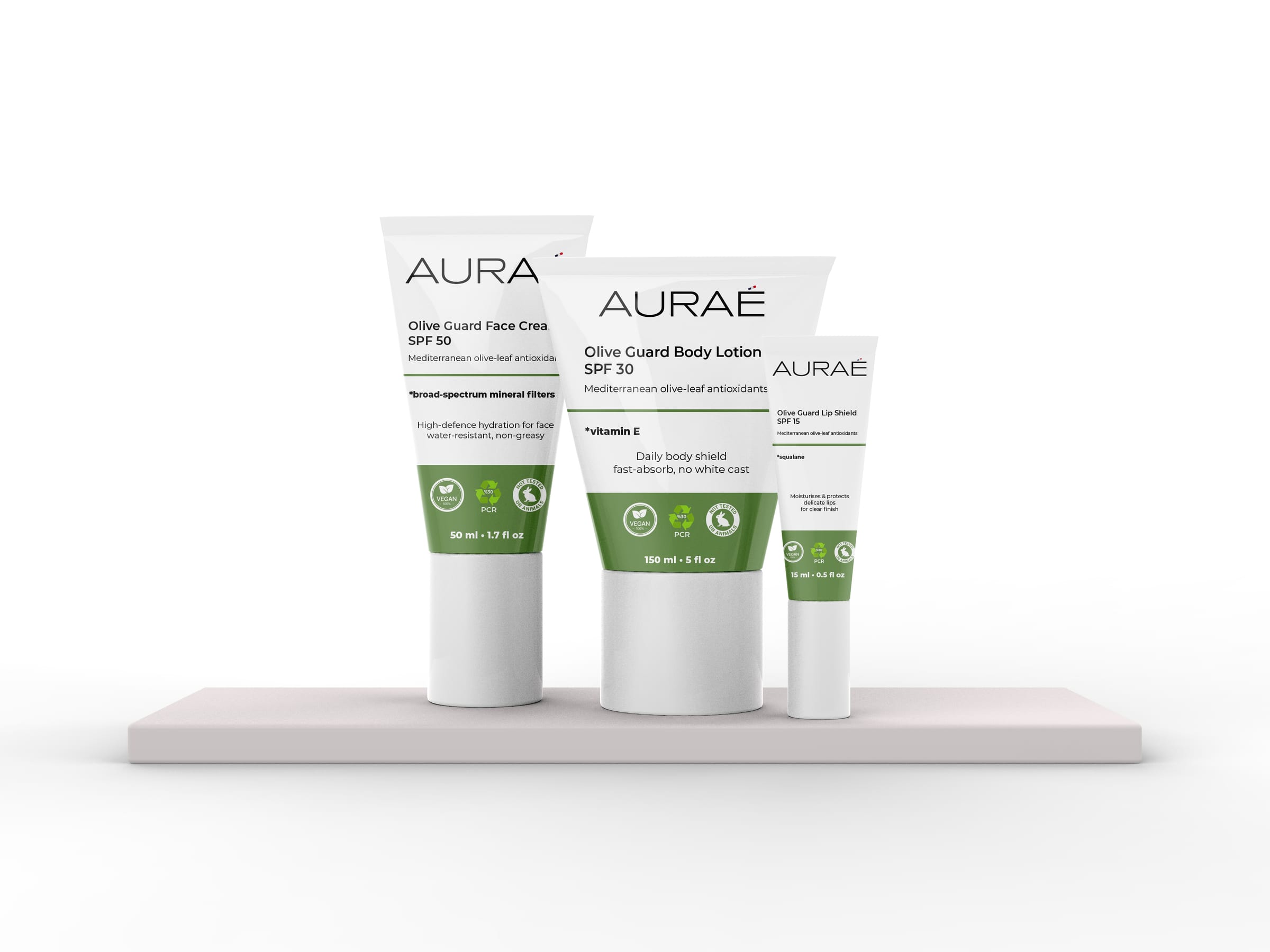
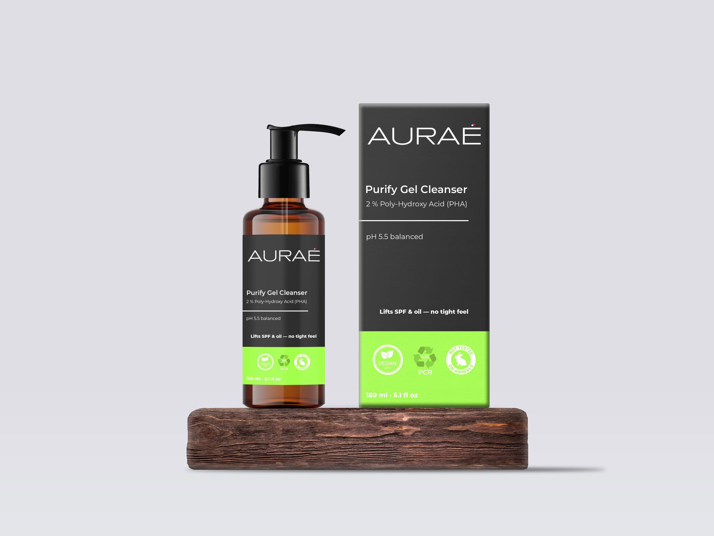
The brand system is built around the kind of claims this category relies on: vegan formulas, cruelty-free positioning, dermatologist-tested reassurance and lower-impact packaging cues. Instead of using soft botanical clichés, the visual system leans on matte black as a science-forward base and uses sharp colour bands to separate product families. The result is meant to feel clear and competent without becoming cold.

Product System
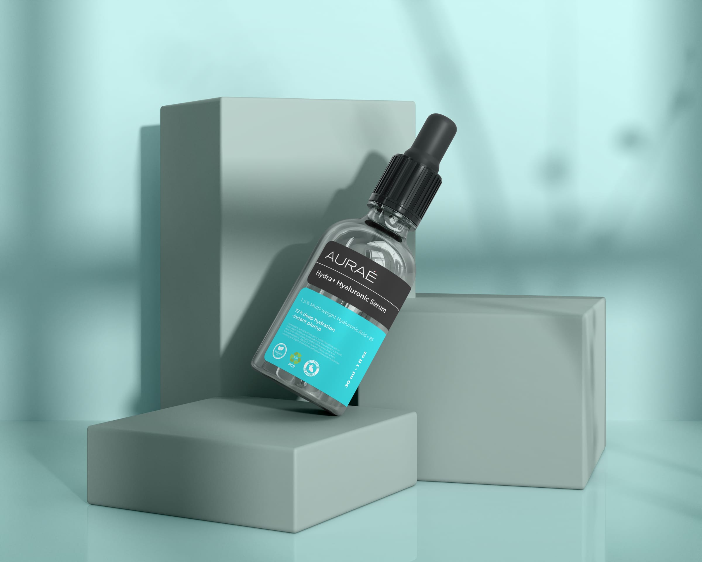
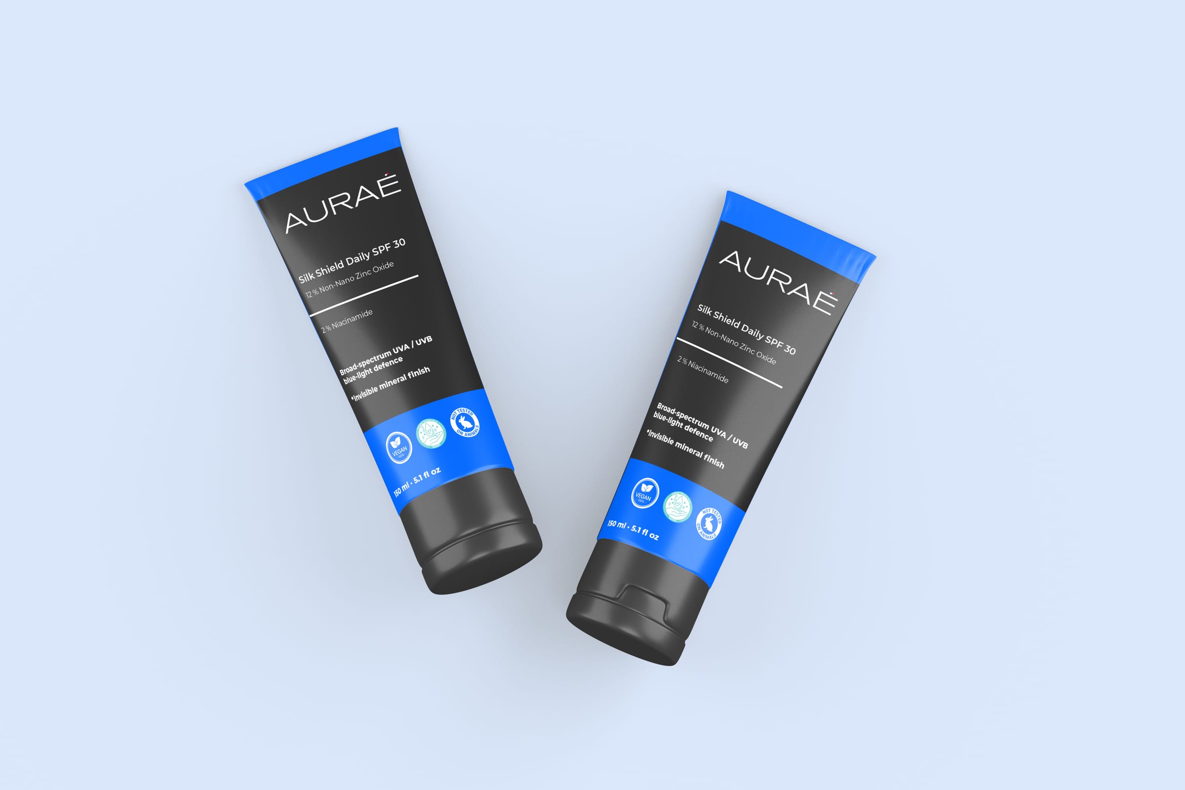
The product line is structured as a daily routine rather than isolated SKUs: cleanser, hydration, protection and targeted treatments. Names combine technical clarity with sensory cues, such as Hydra+ Hyaluronic Serum, Silk Shield Daily SPF 30, Bright-C Radiance Serum and Olive Guard. The large product name, active percentage and benefit line create a repeatable hierarchy across bottles, tubes and cartons.
Sustainability Cues
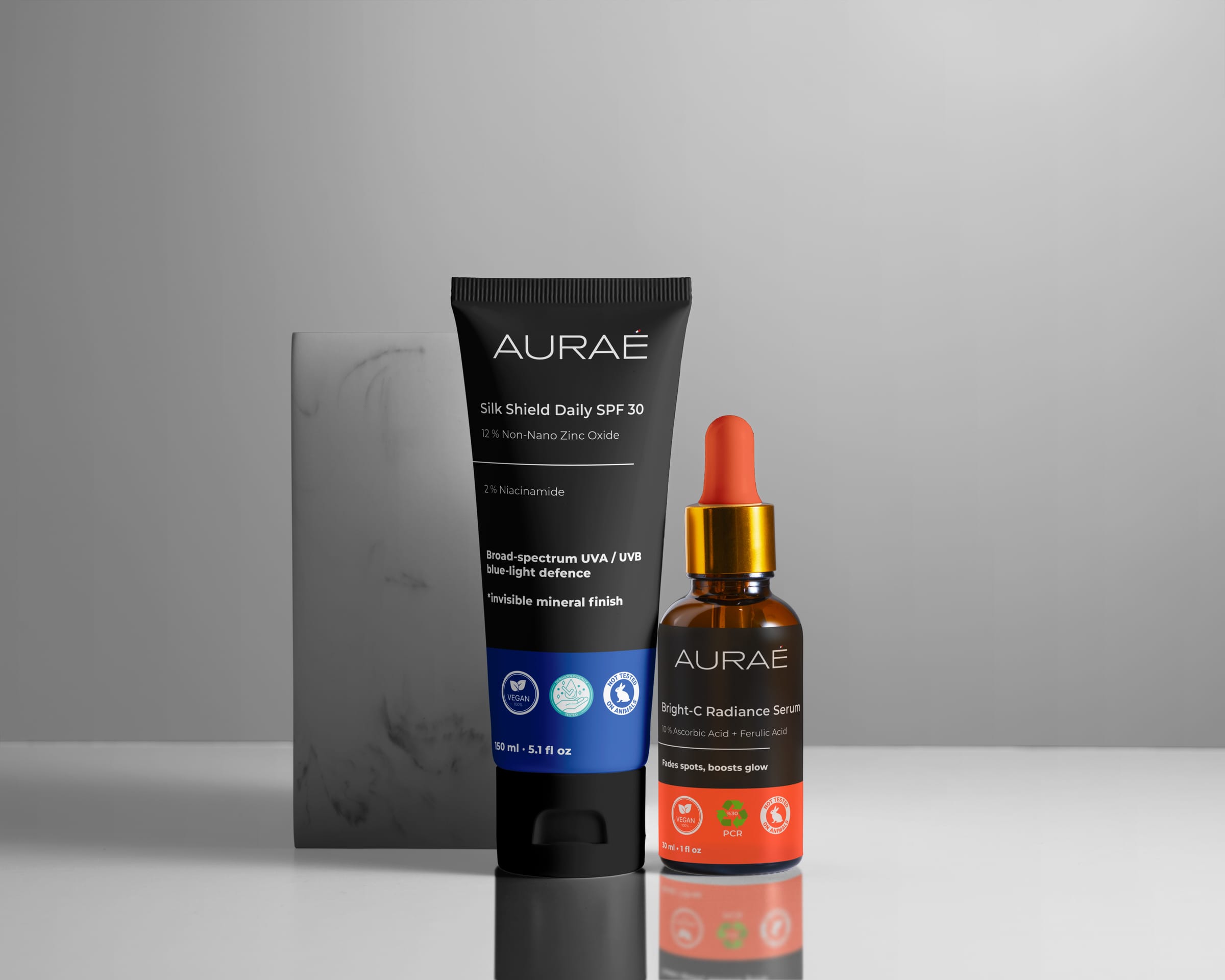
The packaging treats sustainability and material cues as part of the label system. Claim markers for vegan formulas, cruelty-free testing and PCR material sit within the same visual rhythm as the product information, so the concept can communicate responsibility without turning the front label into a wall of badges.