AS
← Work

Casper: E-Commerce UX

A sales-driven UX improvement for Casper, one of Turkey's largest electronics brands. Redesigned the e-commerce flow from homepage to purchase, reducing friction through in-page filtering, reviews, favourites, and a consolidated product page. Shipped and live.

2024UX DesignerFigma, User Research, Competitive Analysis
UX DesignE-CommerceWeb

This is an in-house UX project from my 1.5 years at Casper, one of Turkey's largest consumer electronics brands. The brief came from a business need: too many potential buyers were leaving the website without purchasing, even when they had clear intent. The sales team had mapped the drop-off. The task was to redesign the e-commerce experience (homepage, series listing pages, and product pages) to reduce that friction and keep the purchase path inside casper.com.tr. The Nirvana X700 laptop series was used as the primary design vehicle, but the patterns were designed to apply across the full product catalogue.


The problem

Getting from the Casper homepage to actually buying a specific product variant required 5–6 clicks across multiple pages. Series pages showed products as a flat, unfiltered list with no way to narrow by spec. There were no favourites, no in-page reviews, and no product comparison. Buyers who wanted to evaluate options, or simply find the right configuration, had to navigate away repeatedly, and many didn't come back. A competitive audit of Trendyol and Hepsiburada made the contrast clear.

Old flow
  1. 1.Land on homepage
  2. 2.Click product category
  3. 3.Navigate to product family page (flat list, no filters)
  4. 4.Find the right variant by scrolling
  5. 5.Click through to product detail page
  6. 6.Navigate separately for specs, reviews, or customisation
No filtering on series pages: 12+ SKUs shown with no way to narrow
Reviews and full specs required navigating away from the product
No favourites, no compare: evaluation had to happen in separate browser tabs
Customisation (RAM, storage) handled on a separate page, adding friction at the highest-intent moment
Redesigned flow
  1. 1.Land on homepage
  2. 2.Click category and land directly on filtered series page
  3. 3.Filter by processor, RAM, storage, OS in the left panel
  4. 4.Customise and purchase from the product page in one place
Persistent left-panel filter cuts discovery from 12+ items to relevant subset in one interaction
Favourites (Favorilerim) added to the site header and every product card
Specs, reviews, and FAQ all accessible via tabs, with no navigation away from the product
Özelleştir (Customise) CTA anchored on the product page and on every card
Karşılaştır (Compare) checkbox on product cards for side-by-side evaluation

Process

01
Competitive audit
Mapped the purchase flows and UX patterns of Turkey's leading e-retail platforms (Trendyol, Hepsiburada, Amazon.com.tr) to identify the gap between market best practice and Casper's own site.
02
Stakeholder alignment
Working sessions with the sales team to identify the highest drop-off points. Scope and priorities aligned with C-level and marketing before design began.
03
Design & iteration
High-fidelity designs in Figma for the homepage, series listing pages, and product pages. Multiple rounds of iteration with both the development team and the sales team.
04
Testing & handoff
User testing sessions to validate the new flow against the original. Spec handoff to the development team for implementation across the full product catalogue.

Homepage

The homepage redesign maintained Casper's existing visual identity while sharpening the navigation hierarchy and shortening the path to product entry points. The top bar was updated to surface Favourites and account functions as first-class actions.
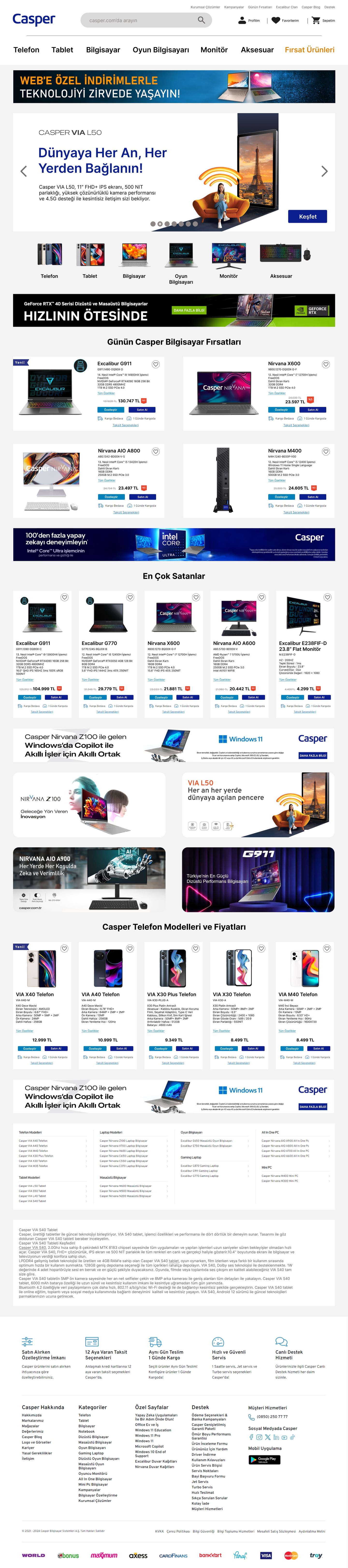
Redesigned Casper homepage showing hero banner, category navigation, and product grid.
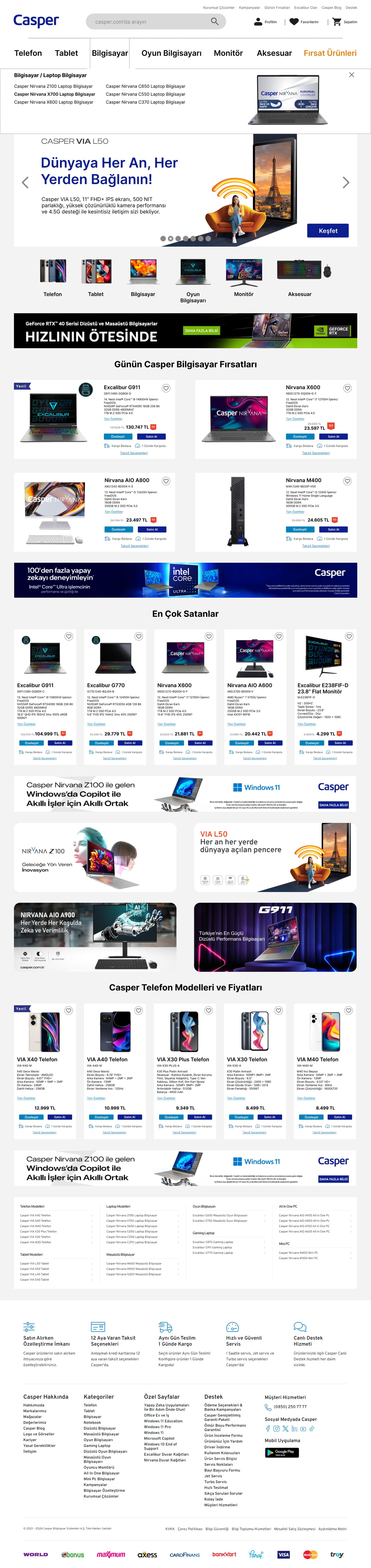
Homepage header detail showing the updated top navigation bar with Favourites and account actions for the X700 series.

Series listing & discovery

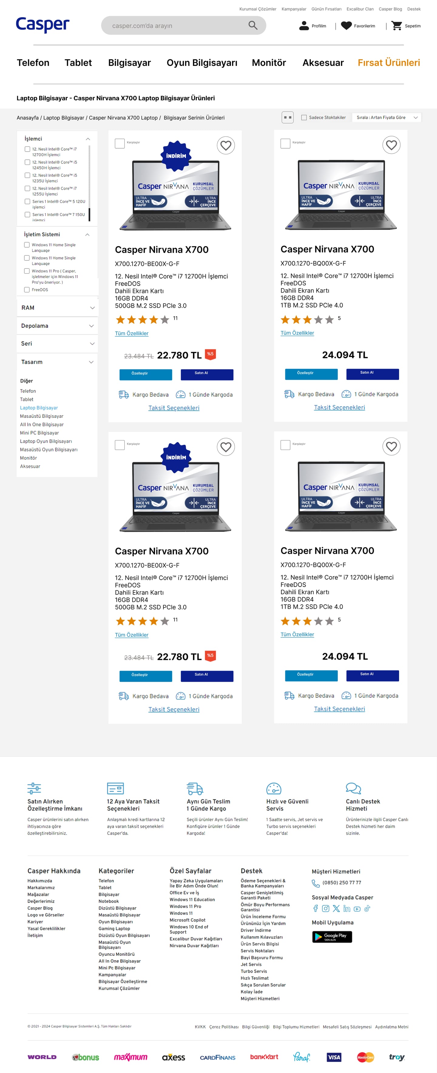
The most significant structural change in the project. Previously, a series page like Nirvana X700 showed every SKU in a flat, undifferentiated list. The redesign introduces a persistent left-panel filter covering processor generation, OS, RAM, storage, and colour, with three grid-density options (2-up, 3-up, 4-up). A buyer can go from 12+ variants to their relevant shortlist in a single interaction, without ever leaving the page.
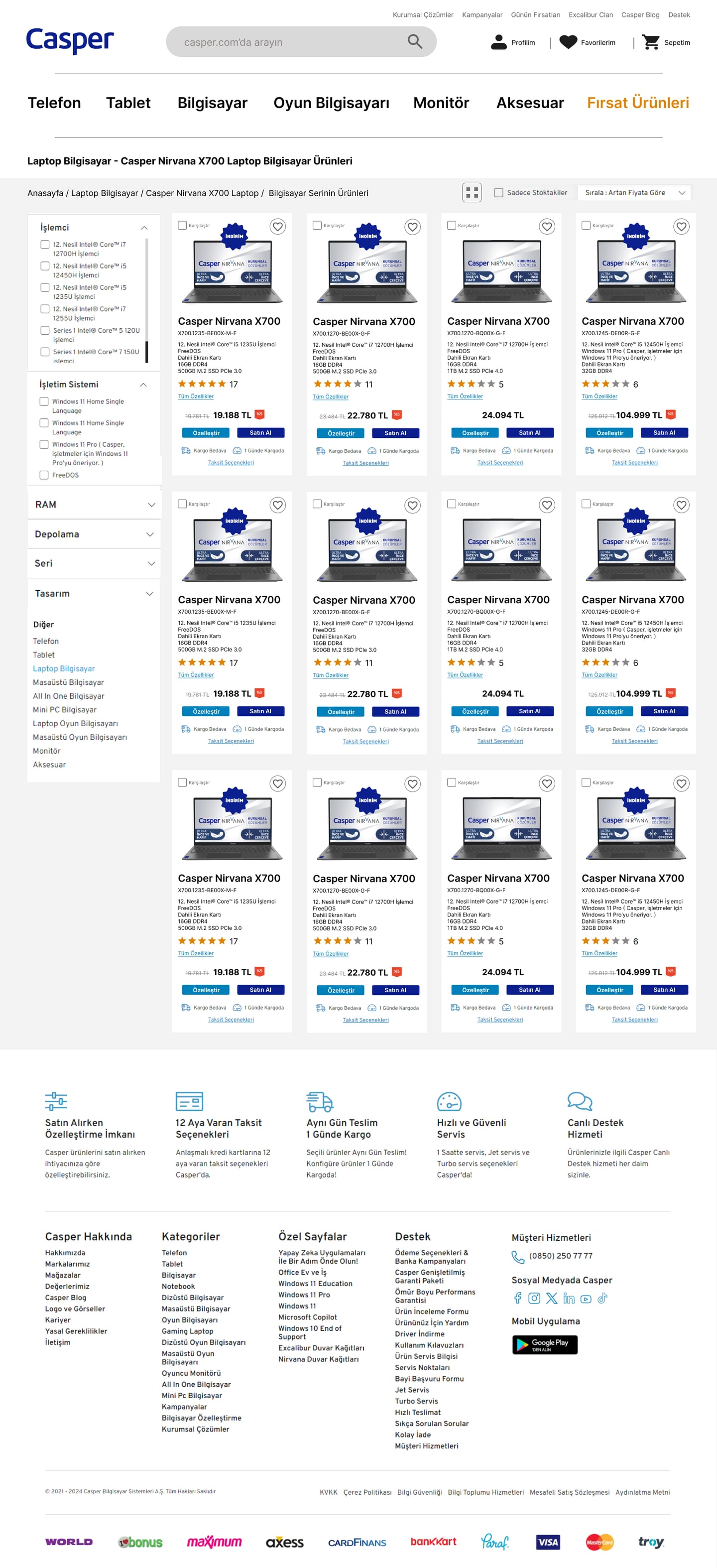
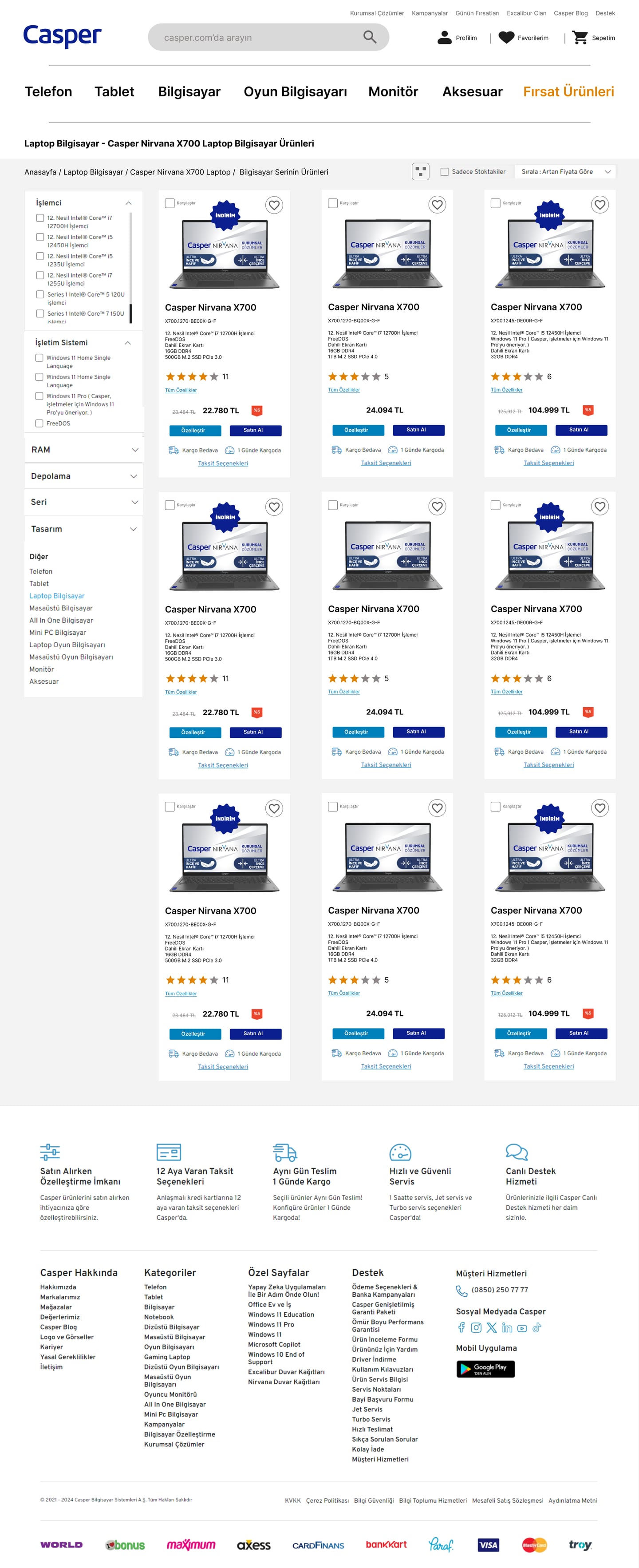
Series listing page in 4-column grid view with left-panel filters for the Nirvana X700 range.
Series listing in 3-column grid view.
Series listing in 2-column grid view showing more product detail per card.

Product page

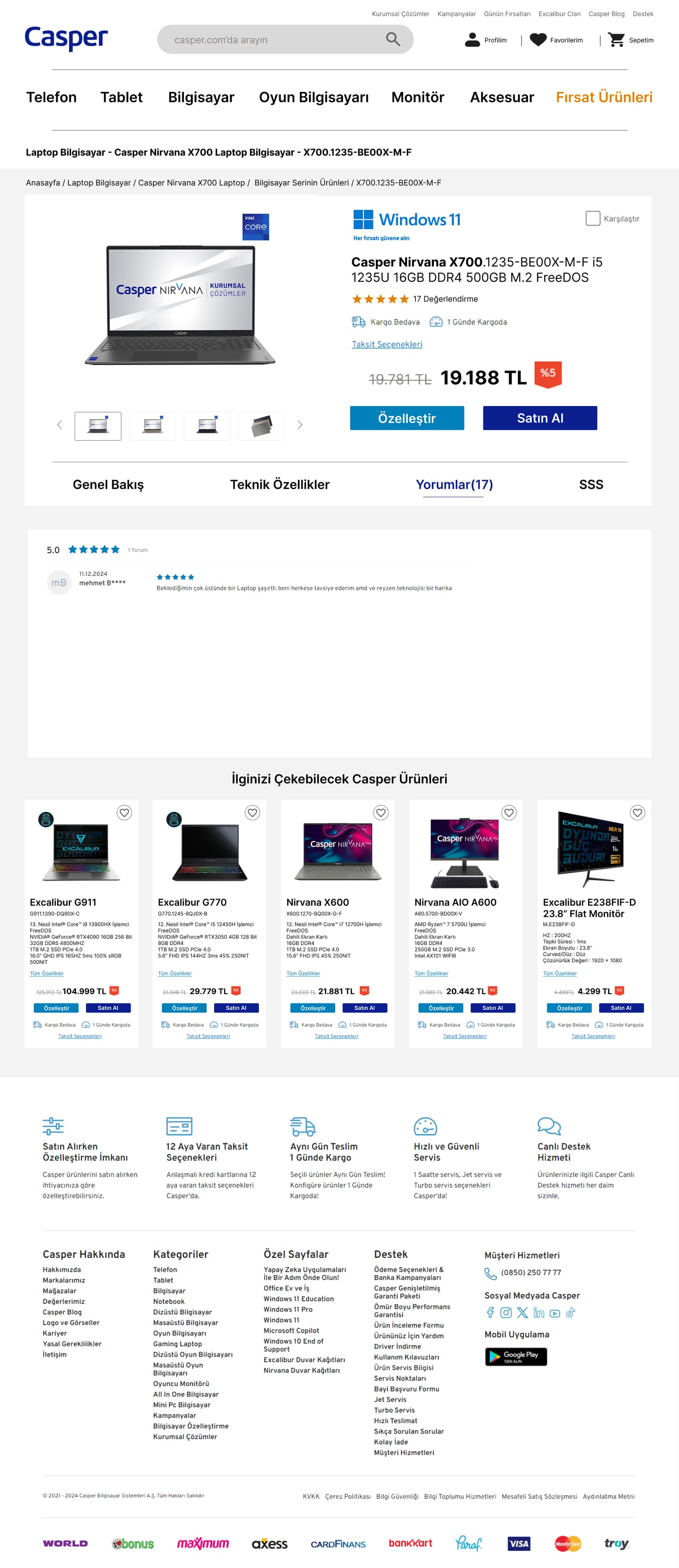
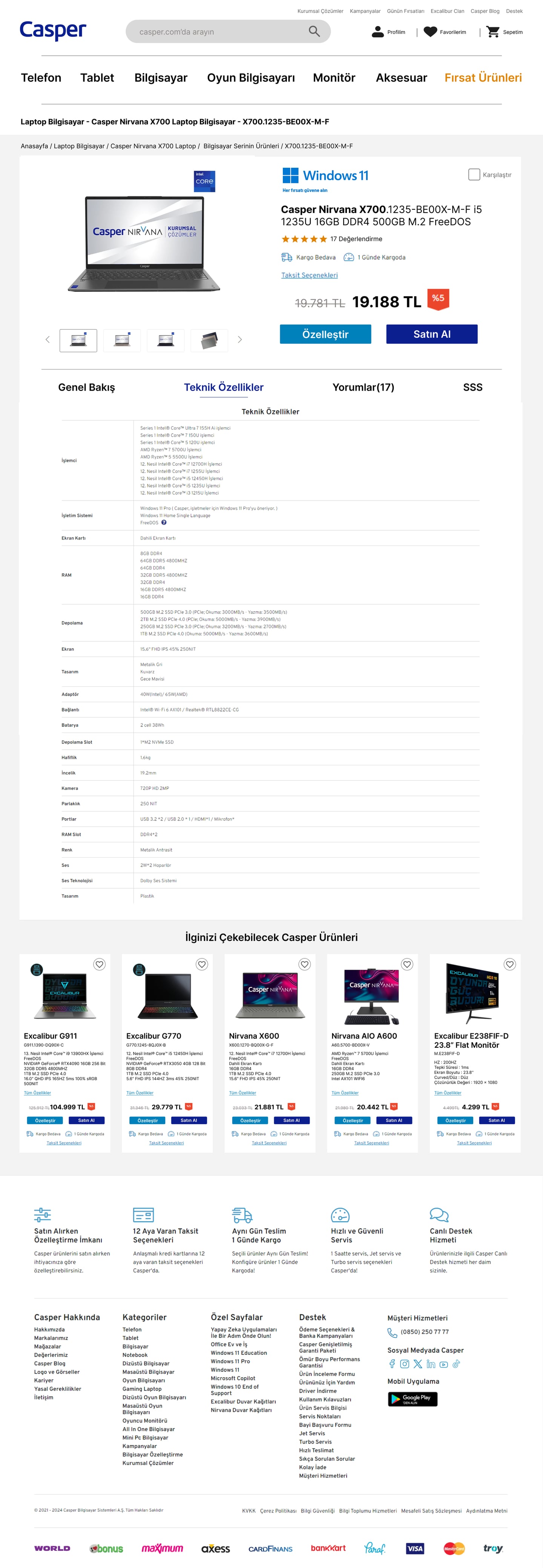
The product page consolidated everything a buyer needs into a single tabbed experience: feature overview, full technical specifications, user reviews, and FAQ, all without navigating away. The Özelleştir (Customise) and Satın Al (Buy Now) CTAs are anchored in the product summary panel throughout scrolling, so the purchase action is always reachable regardless of where the user is on the page.

Full scroll view of the redesigned Nirvana X700 product page showing feature highlights, AI capabilities, display specs, connectivity, and battery sections.
Product page on the Technical Specifications tab showing a full spec comparison table.
Product page on the Reviews tab showing star ratings and user reviews in-page.

What shipped

The redesign was implemented by Casper's development team and is live on casper.com.tr. Favourites, compare, in-page filtering, tabbed product pages, and consolidated CTAs are visible across the full product catalogue. This was a cross-team company project: the sales team provided drop-off data that shaped the scope, the marketing team collaborated on the competitive audit, and multiple rounds of user testing and internal review happened before development handoff. As a company project, performance metrics and internal testing data are not shared publicly. The comparisons below, captured using the Wayback Machine, show the before and after states of what actually shipped.


Before / after
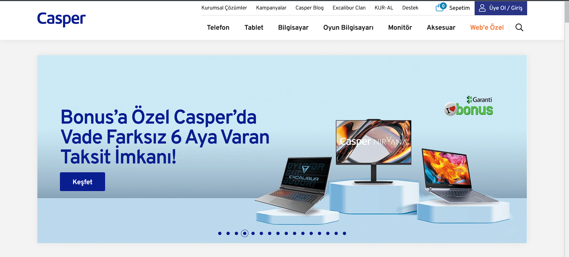
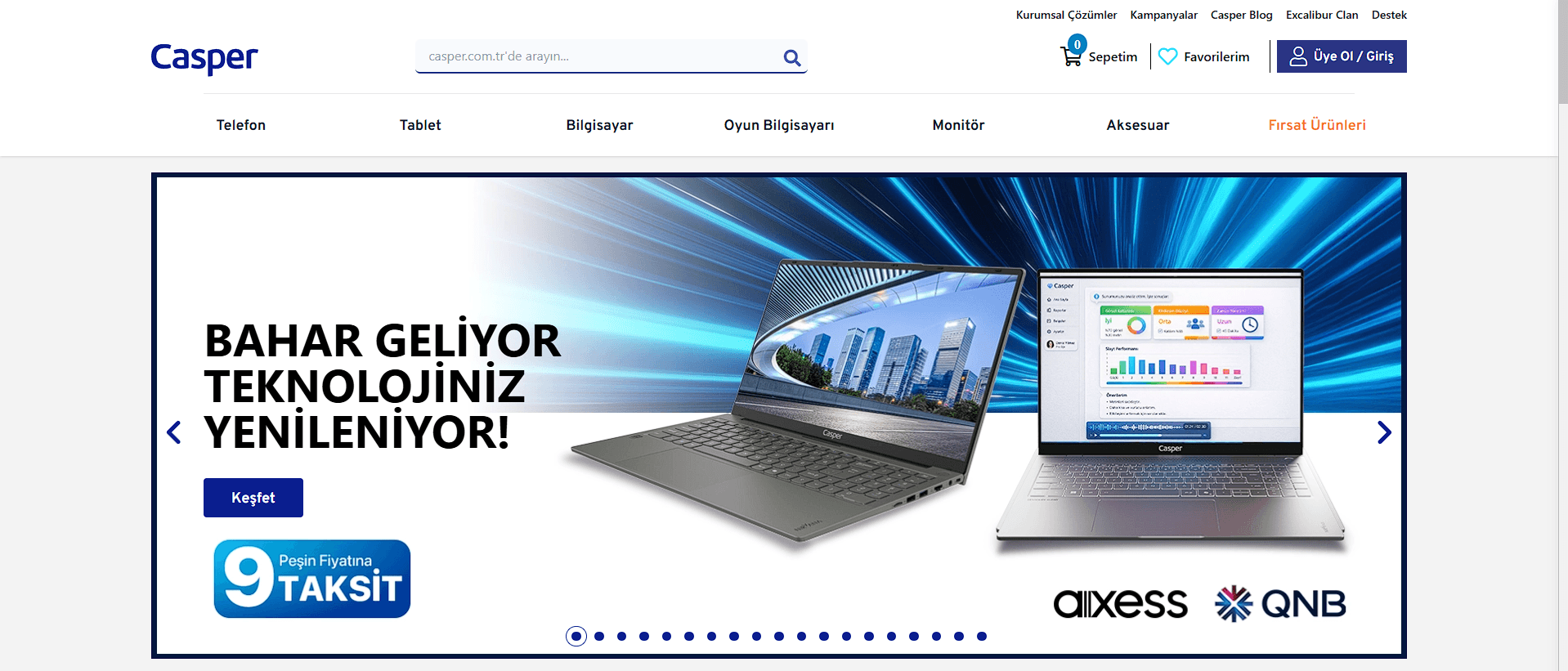
Old Casper homepage header: top bar shows only cart and login, no Favourites.Before
Redesigned Casper homepage header: Favorilerim heart icon added to the top bar alongside cart and account.After
Homepage header. Before: top bar held only cart and login. After: Favorilerim is a first-class action, visible on every page.
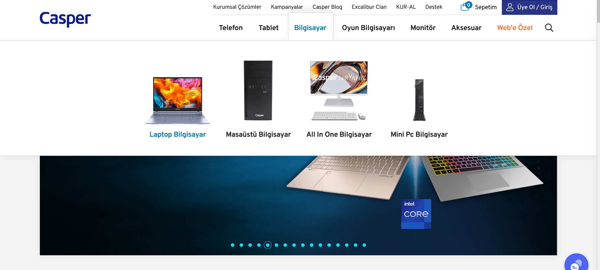
Old navigation: clicking Bilgisayar opened a sub-category page with Laptop, Masaüstü, All In One, Mini PC icons, requiring an extra click before reaching any product list.Before
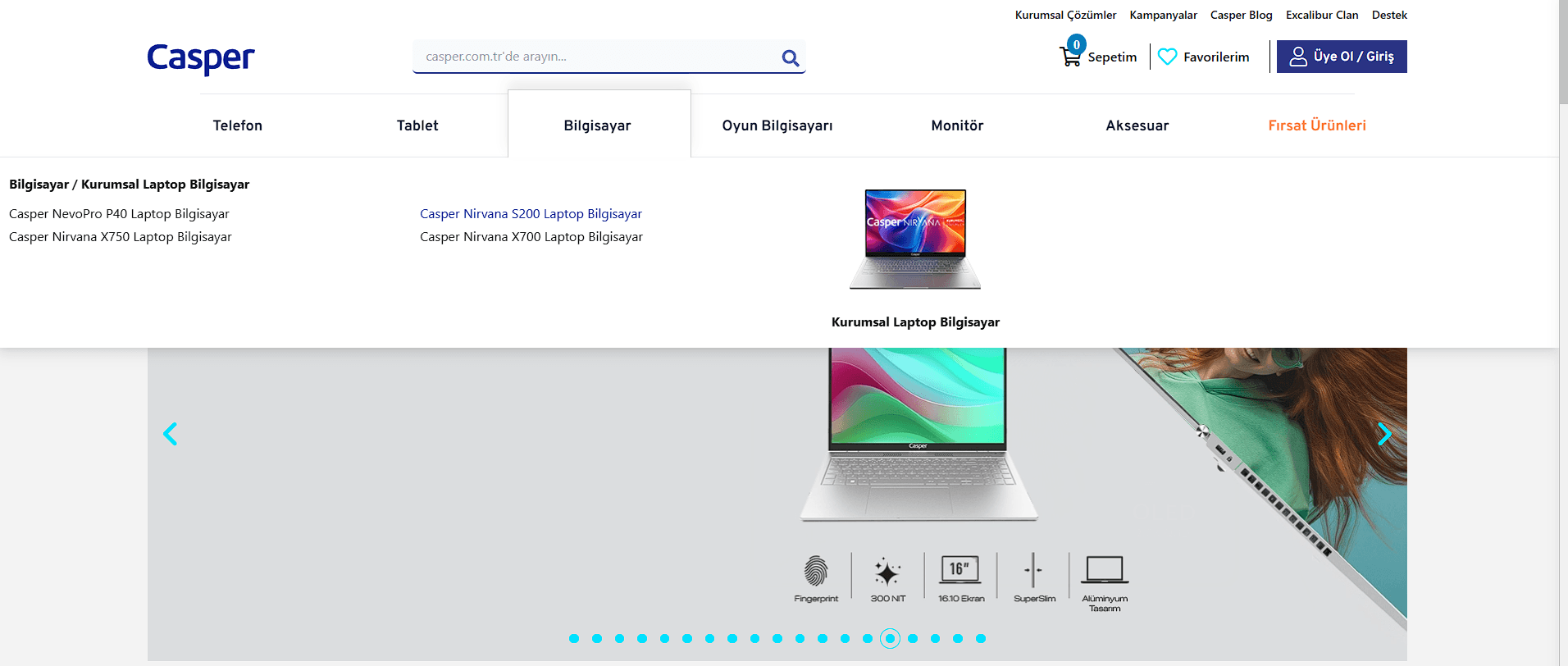
Redesigned navigation: hovering Bilgisayar surfaces direct links to product families including Nirvana X700 and 5200, bypassing the sub-category page entirely.After
Navigation to a laptop series. Before: Bilgisayar led to a sub-category page, requiring another click before reaching any product. After: hovering the tab surfaces direct series links, cutting a full step from the path.
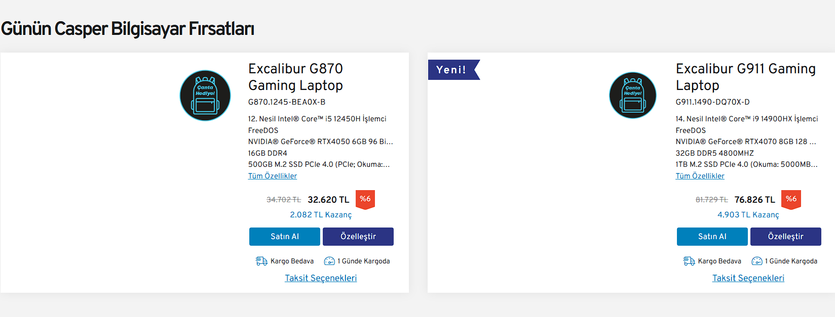
Earlier shipped Casper laptop cards showing compact product cards with specs, pricing, and purchase actions.Before
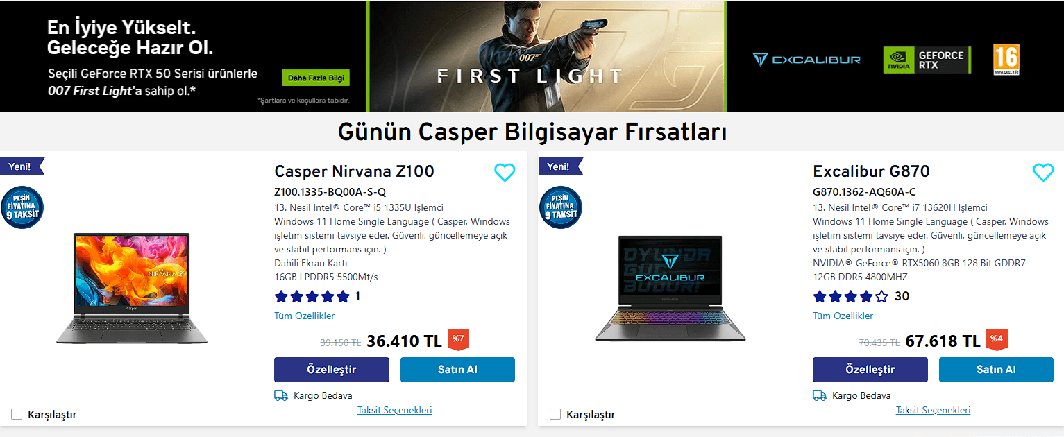
Updated Casper product cards showing richer laptop imagery, ratings, compare, favourites, pricing, and purchase actions.After
Product cards. Before: compact shipped cards with specs, pricing, and purchase actions. After: richer product cards with larger imagery, ratings, compare, favourites, pricing, and direct buy and customize actions.
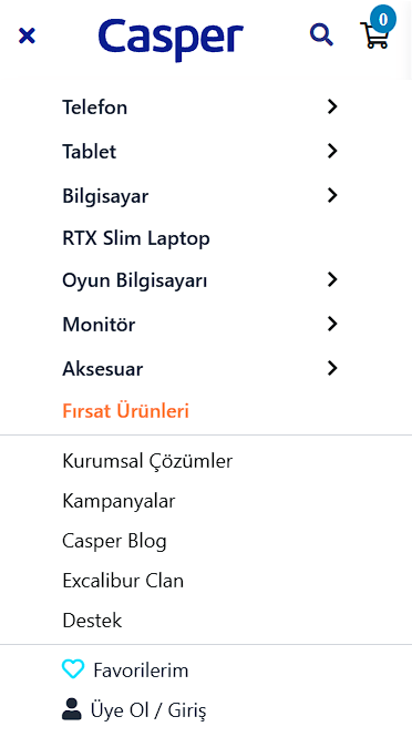
Old mobile navigation menu: flat list with Favourites buried at the very bottom below all secondary links.Before
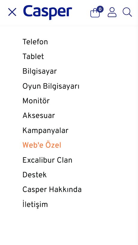
Redesigned mobile navigation menu: clean hierarchy with cart, account, and search icons in the header bar, and a reorganised category list.After
Mobile navigation. Before: Favorilerim buried at the foot of a flat list. After: cart, account, and search in the header; cleaner category hierarchy below.

Live site
The redesigned e-commerce experience is currently live on Casper's website.
View casper.com.tr →