MedPass
A healthcare app concept for Austrian patients - one place to manage prescriptions, access medical documents, and control who sees your health data. Developed at FH JOANNEUM with an interdisciplinary team.
MedPass is a mobile app concept for Austrian patients that consolidates prescriptions, health documents, and data access control in one place. The project was developed during Summer Semester 2026 at FH JOANNEUM as part of an interdisciplinary team combining Interaction Design and Internal Management students. My role covered the full UX and UI design process: research, information architecture, interaction design, visual design, and the complete brand identity.
The problem
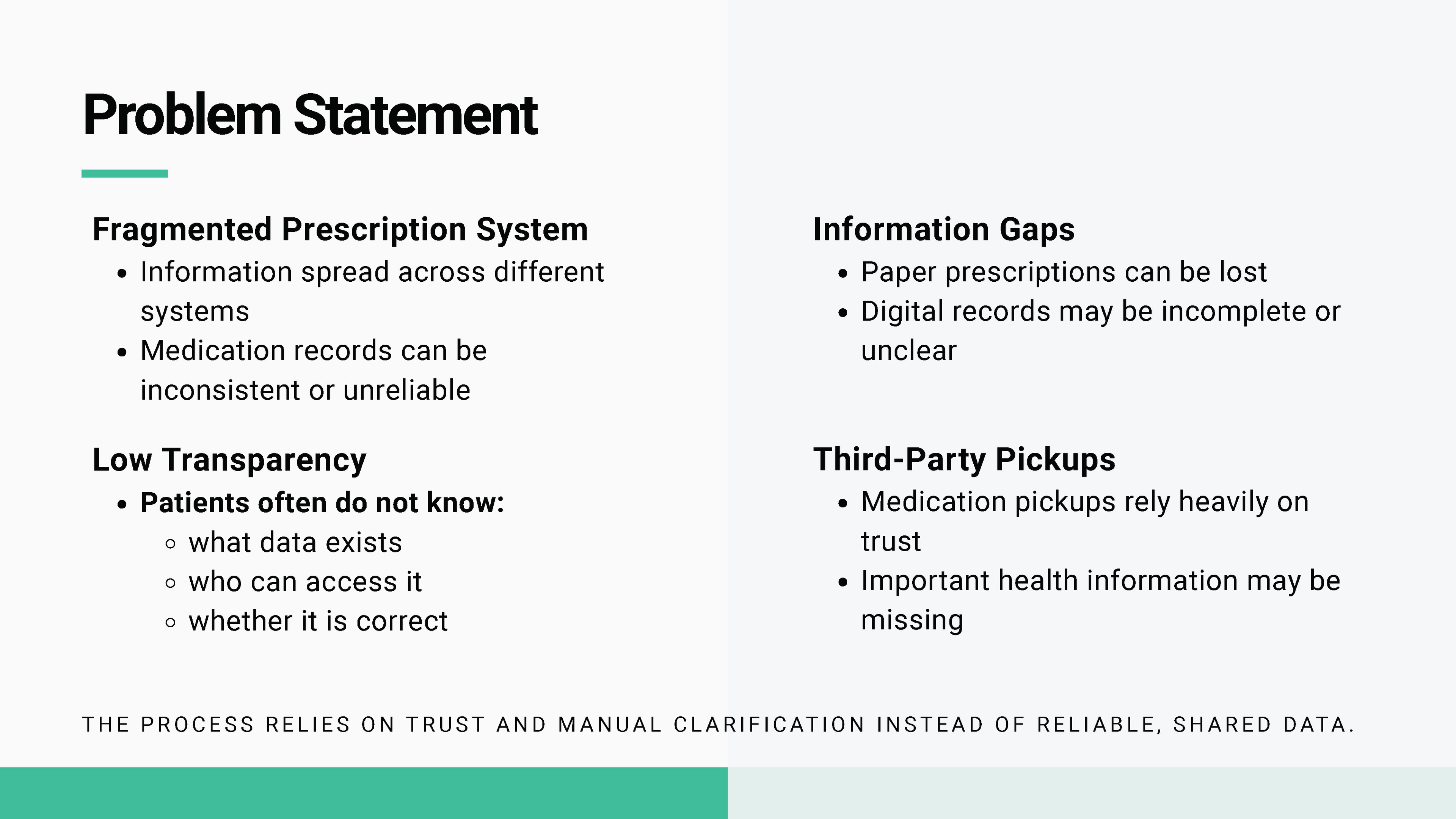
Austria's healthcare system is digital in infrastructure but fragmented in practice. Patients hold multiple systems - ELGA for records, individual pharmacy apps for prescriptions, separate portals for appointments - none of which talk to each other clearly. During qualitative interviews, three recurring friction points emerged: people did not know what prescriptions they had outstanding, they could not easily see who had accessed their health data, and navigating the paper-based and digital systems in parallel felt like a second job.
Interview approach
The research phase centred on seven semi-structured interviews with Austrian patients who had different relationships to the healthcare system: people managing recurring prescriptions, people who only visit doctors occasionally, international students navigating Austrian systems for the first time, and older participants who rely on a mix of paper documents, phone calls, and family support. Instead of asking whether they wanted another health app, we asked them to reconstruct recent healthcare moments step by step: getting a prescription, finding a pharmacy, receiving a lab result, bringing documents to an appointment, or trying to understand who could see their ELGA data.
The most useful interview material came from breakdown moments. Participants rarely described the system as completely broken; they described small uncertainties that stacked up: not knowing whether an e-prescription was already active, forgetting which pharmacy had a medication in stock, searching through emails for a PDF at an appointment, or feeling uneasy because data access technically existed but was not explained in patient language. These stories shaped MedPass as a trust and visibility layer rather than a feature-heavy health super-app.
Pain points from the interviews
Research
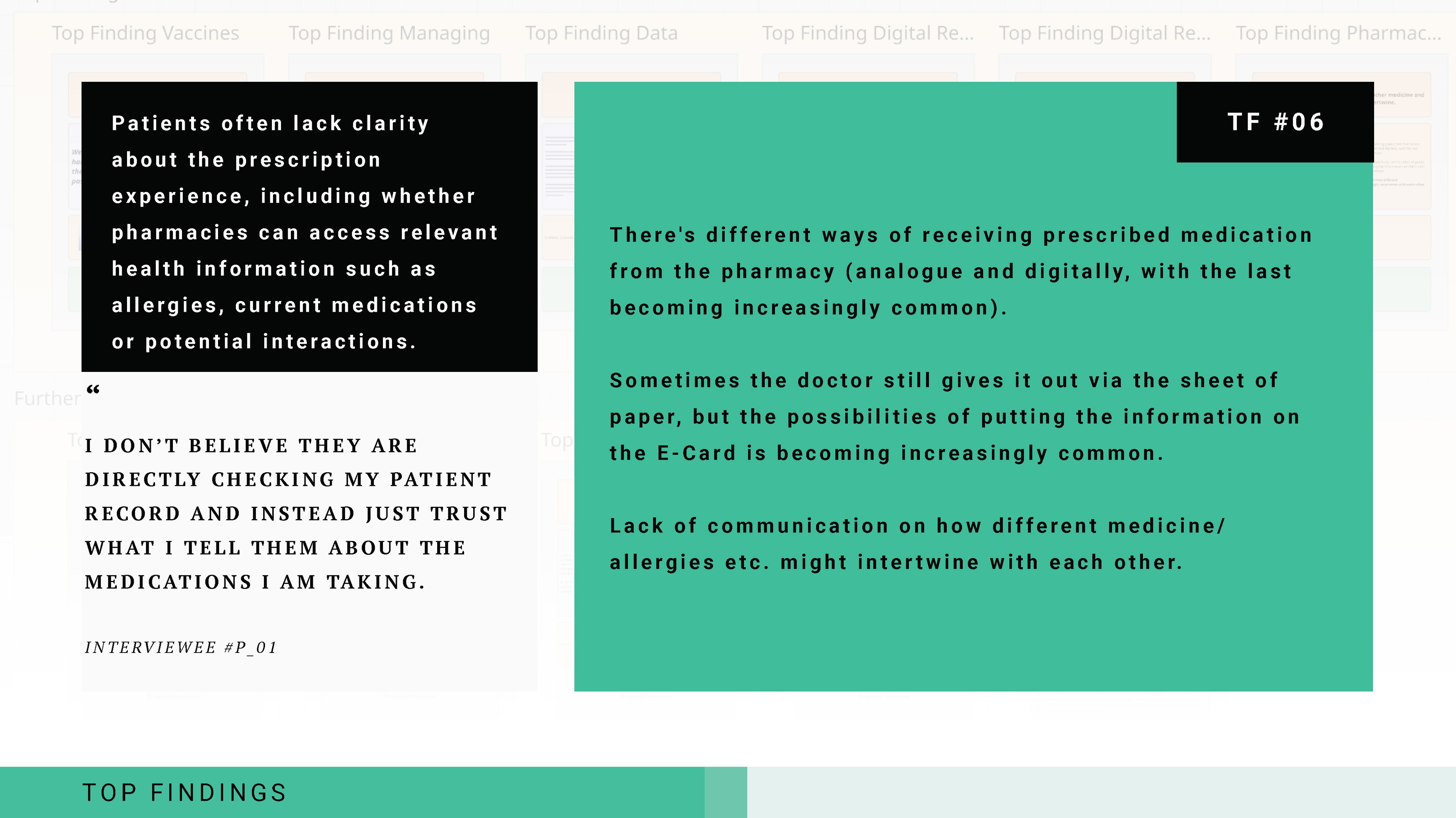
We ran seven qualitative interviews with Austrian patients across different age groups and healthcare usage patterns. Interviews were semi-structured, covering recent interactions with the healthcare system, their awareness of ELGA and e-prescriptions, and specific moments where things went wrong or caused confusion. We synthesised findings using affinity mapping, grouping statements into themes and then prioritising by frequency and severity. The process produced twelve top findings (TF#01–TF#12). The team selected TF#06 - the invisibility of prescription status and data access - as the primary design focus, because it had the highest frequency across interviews and the clearest gap between current system capability and user expectation.
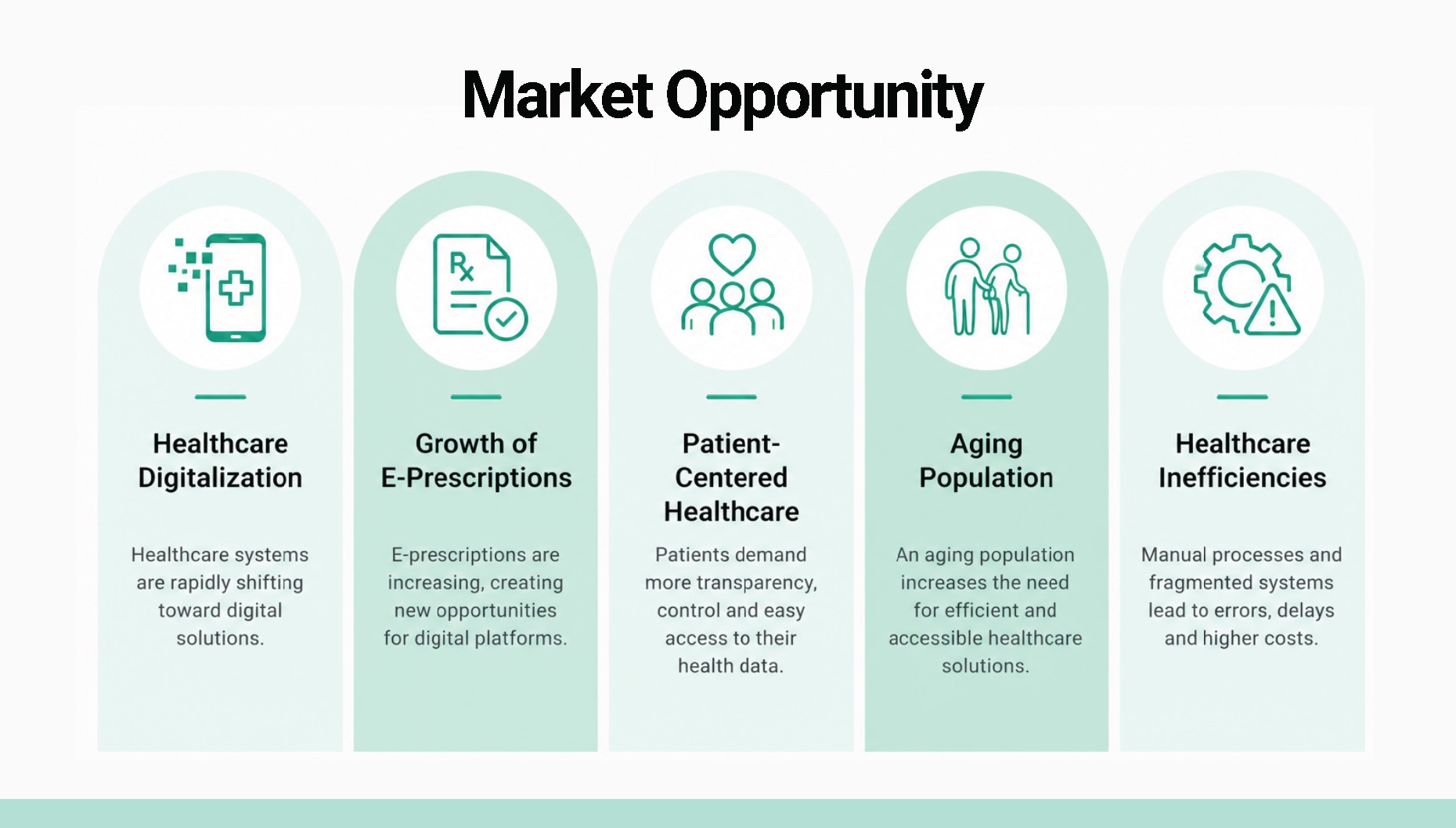
Market context
We mapped the existing landscape of patient-facing healthcare tools in Austria against key capability dimensions: prescription management, document access, data control transparency, and appointment coordination. Most tools addressed one or two of these - the official ELGA portal covers document access but not prescription status; pharmacy apps handle pickup but not history or data visibility. MedPass was positioned as the first layer that cuts across all four dimensions for the patient, without replacing the clinical systems that healthcare providers already use.
Service blueprint
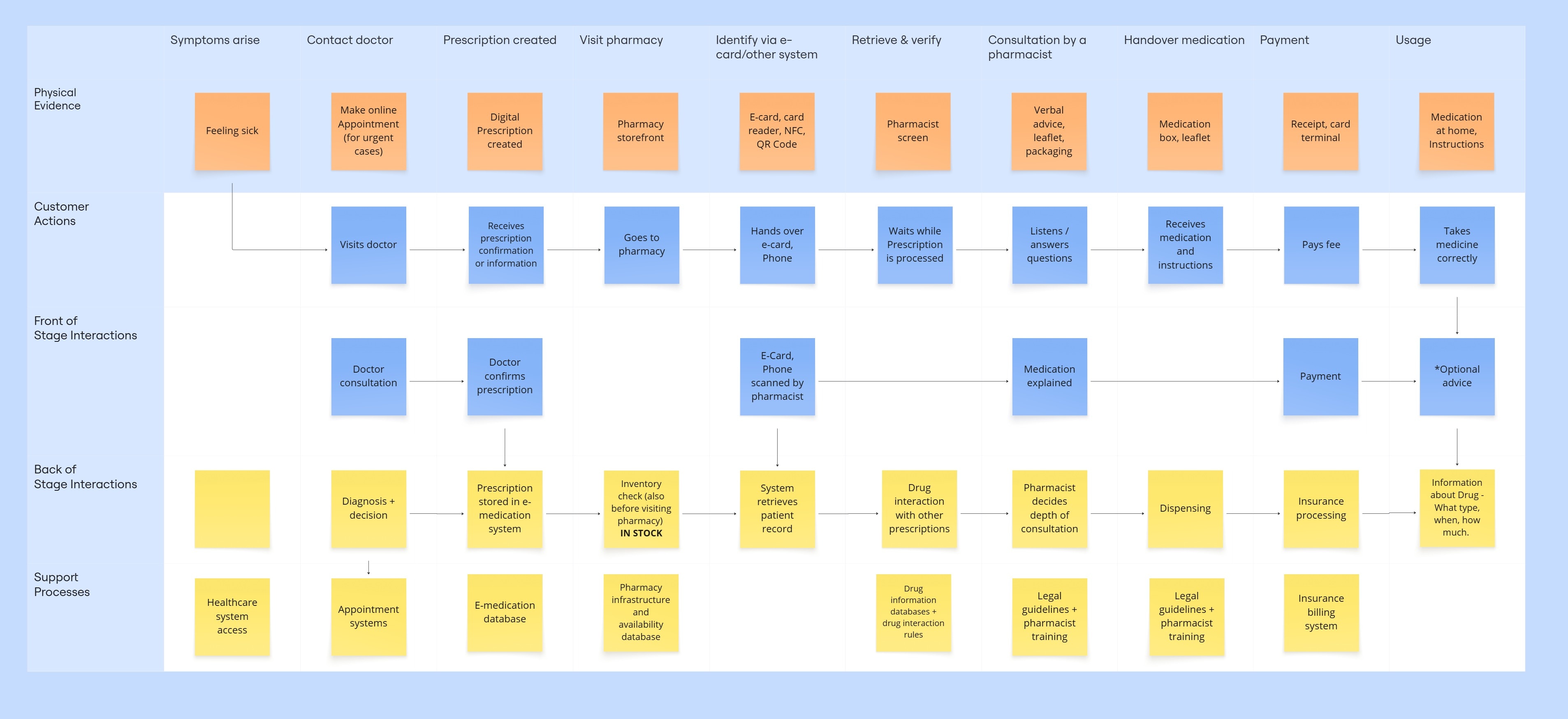
The service blueprint maps the full prescription journey - from a doctor issuing an e-prescription through the patient receiving a notification, locating a nearby pharmacy, picking up the medication, and viewing the completed record in their history. It traces actions across the patient, the MedPass app layer, backend systems (ELGA, pharmacy network), and supporting actors (GP, pharmacist). The blueprint was critical for identifying exactly where the current system fails: the patient has no confirmed visibility between prescription issuance and pharmacy pickup, and no log of who accessed what.
Information architecture
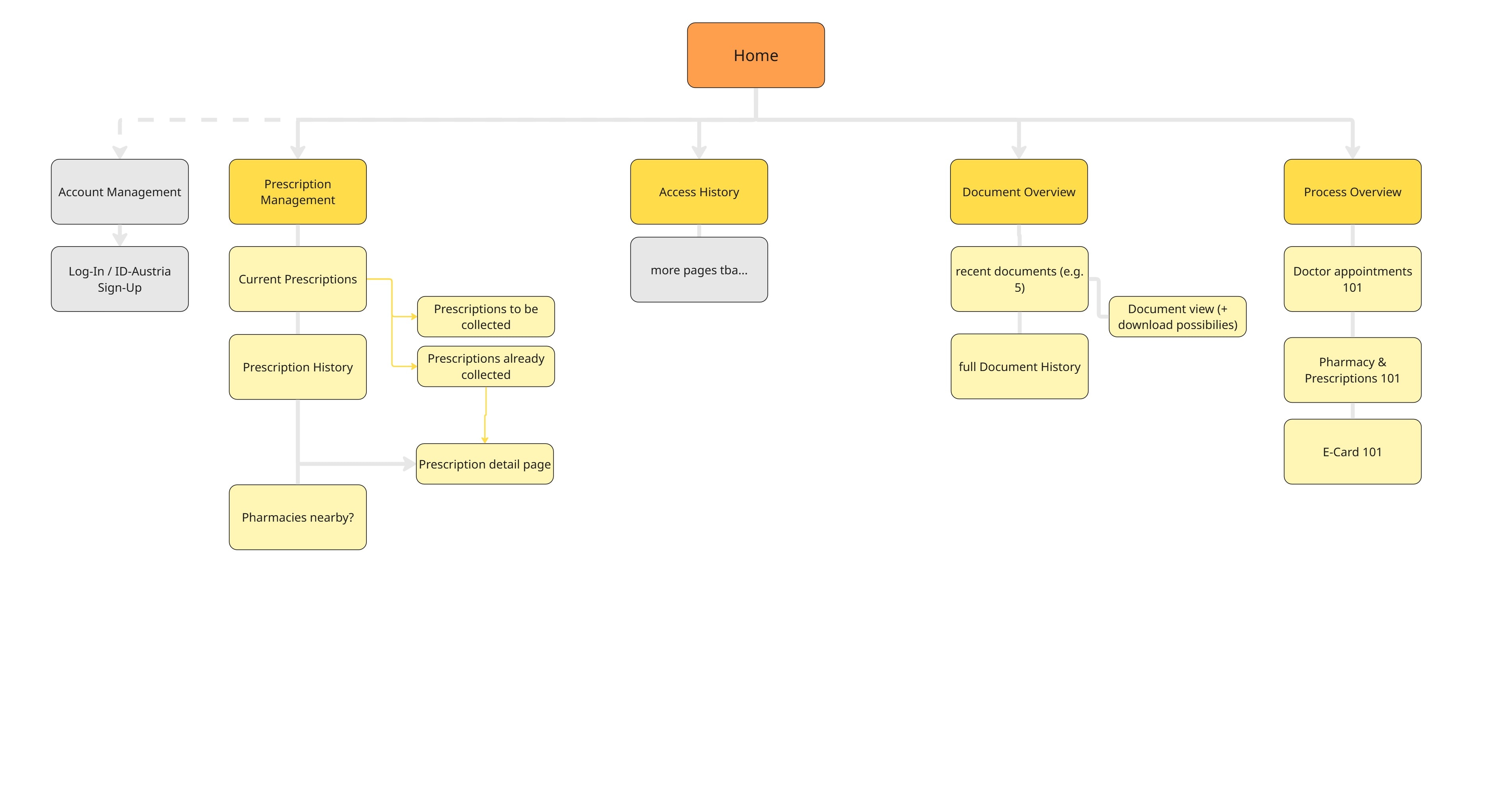
The information architecture organises MedPass around four primary destinations: Home (overview and notifications), Prescriptions (active, pending, completed), Documents (health records, lab results, discharge papers), and Processes (data access log, access control settings). Navigation is flat - no nested menu hierarchies - because the target users include elderly and lower-digital-literacy patients who need direct, predictable access to each section. The IA also defines where emergency document sharing and quick pharmacy location fit within the flow, without requiring users to navigate away from their current context.
Lean canvas
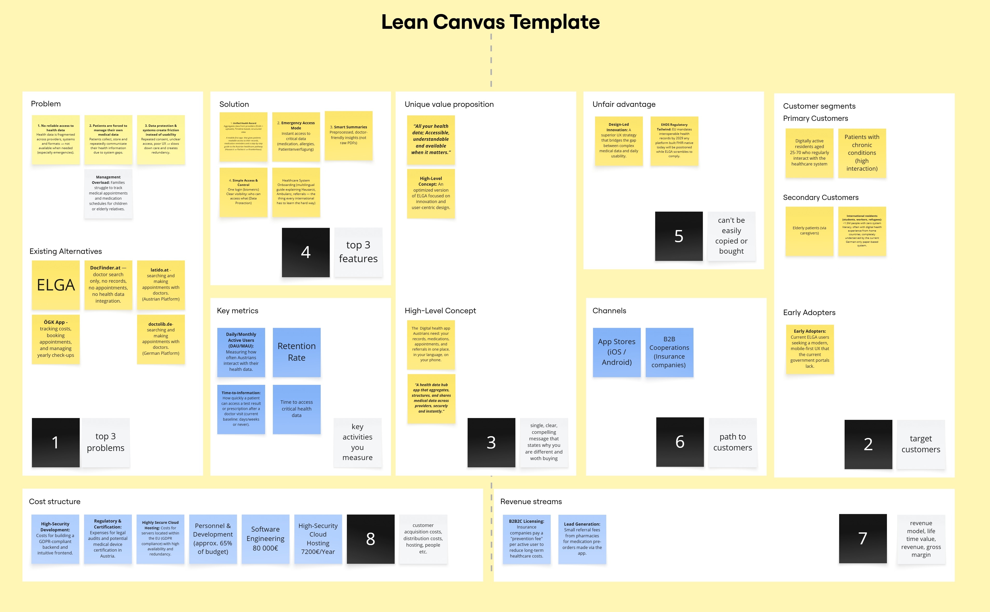
The business framing of MedPass - validated as part of the interdisciplinary module - positioned it as a patient-side companion layer to Austria's existing healthcare infrastructure, rather than a competing clinical system. The lean canvas identified the customer segment (Austrian patients using ELGA), the core value proposition (unified view of prescriptions, documents, and data access in one app), key partnerships (ELGA API, pharmacy networks, ID Austria authentication), and revenue model (government procurement / integration licensing, not a consumer subscription).
The interface layer is presented through the system work first, then through applied mockups. That order matches how the project was built: define the trust cues, accessibility rules, and component logic before showing the product in context.
Brand guideline
The brand guideline documents the visual identity behind MedPass: the secure health-record mark, teal colour system, typography, layout rules, icon behaviour, and applied examples. It frames the product as calm, official-feeling, and approachable without falling into cold hospital aesthetics.
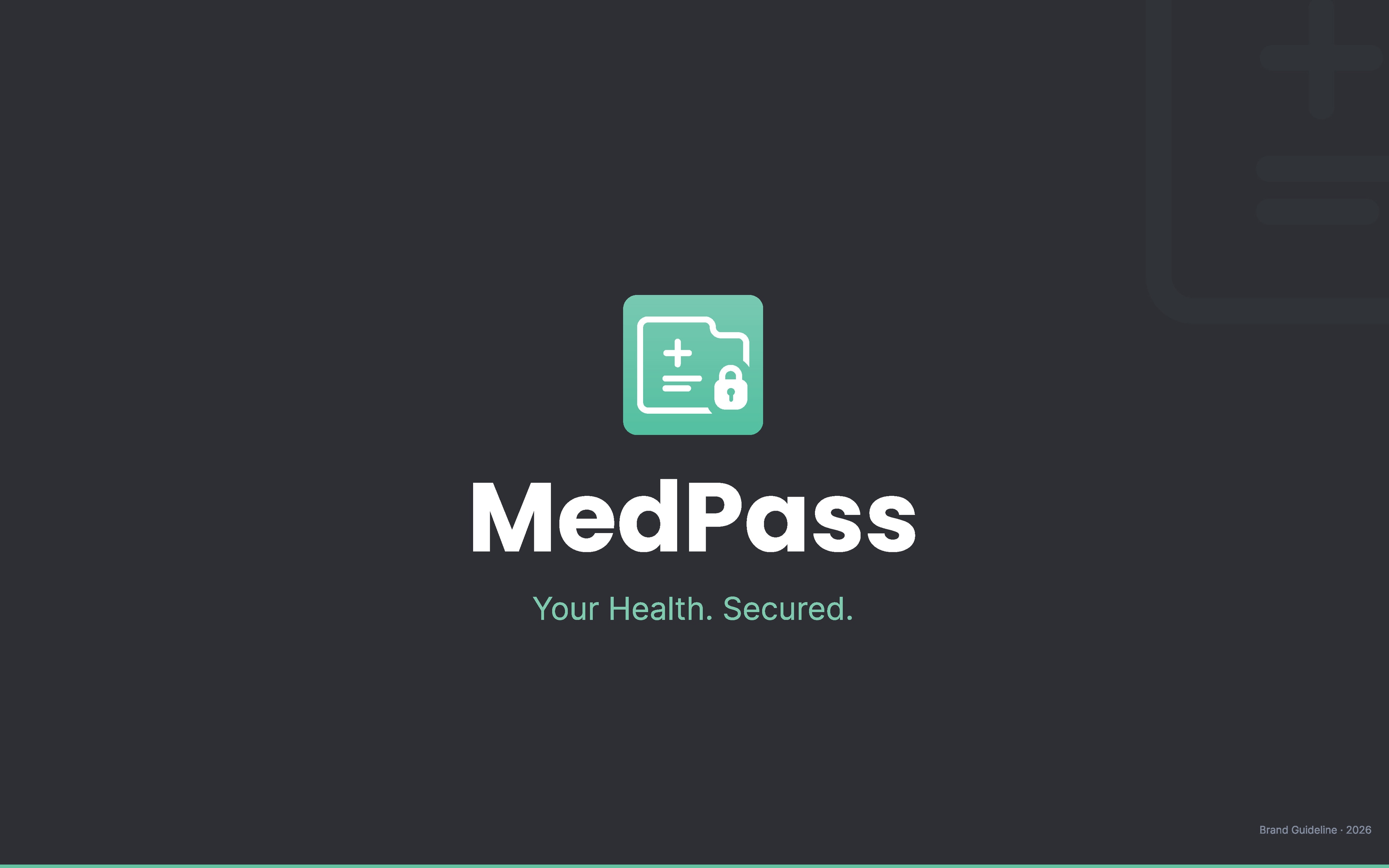
Brand guideline - 18-page identity reference, presented as a scrollable book.
Design system
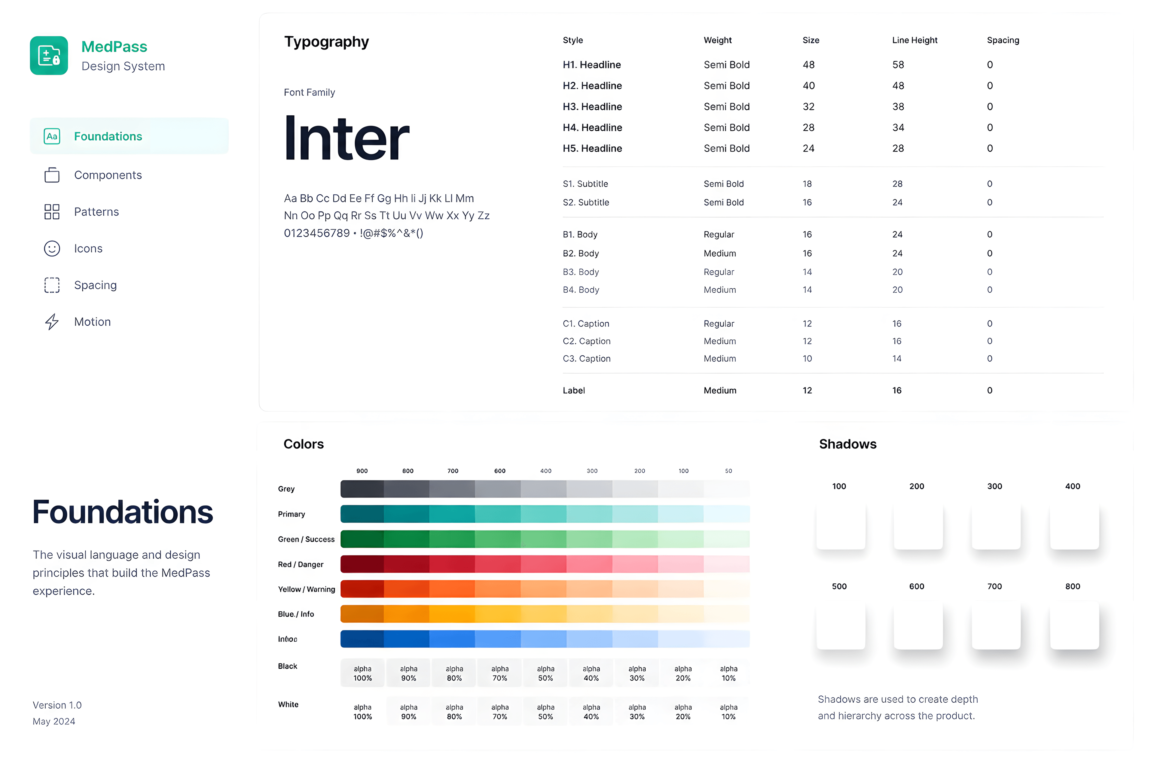
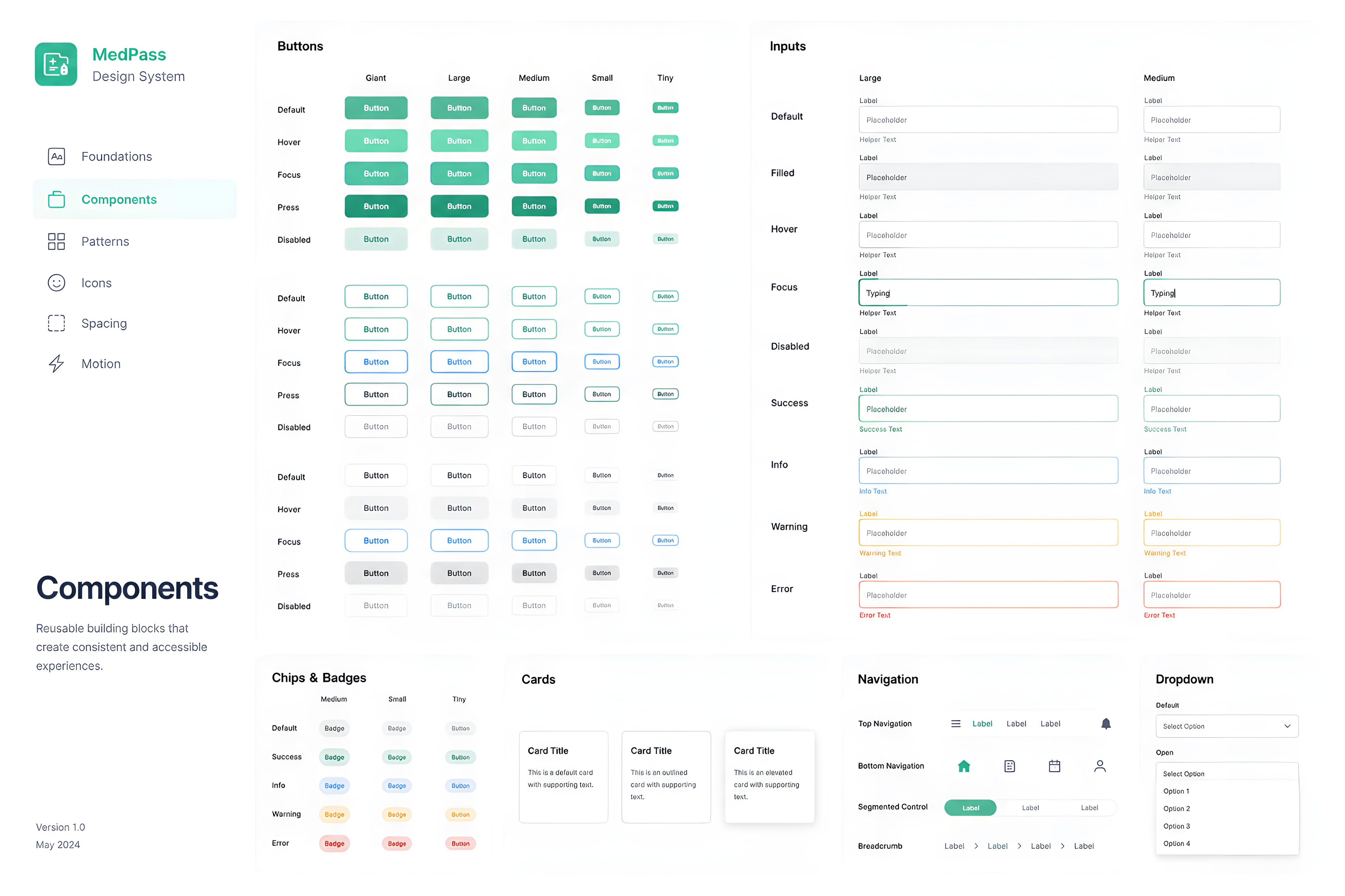
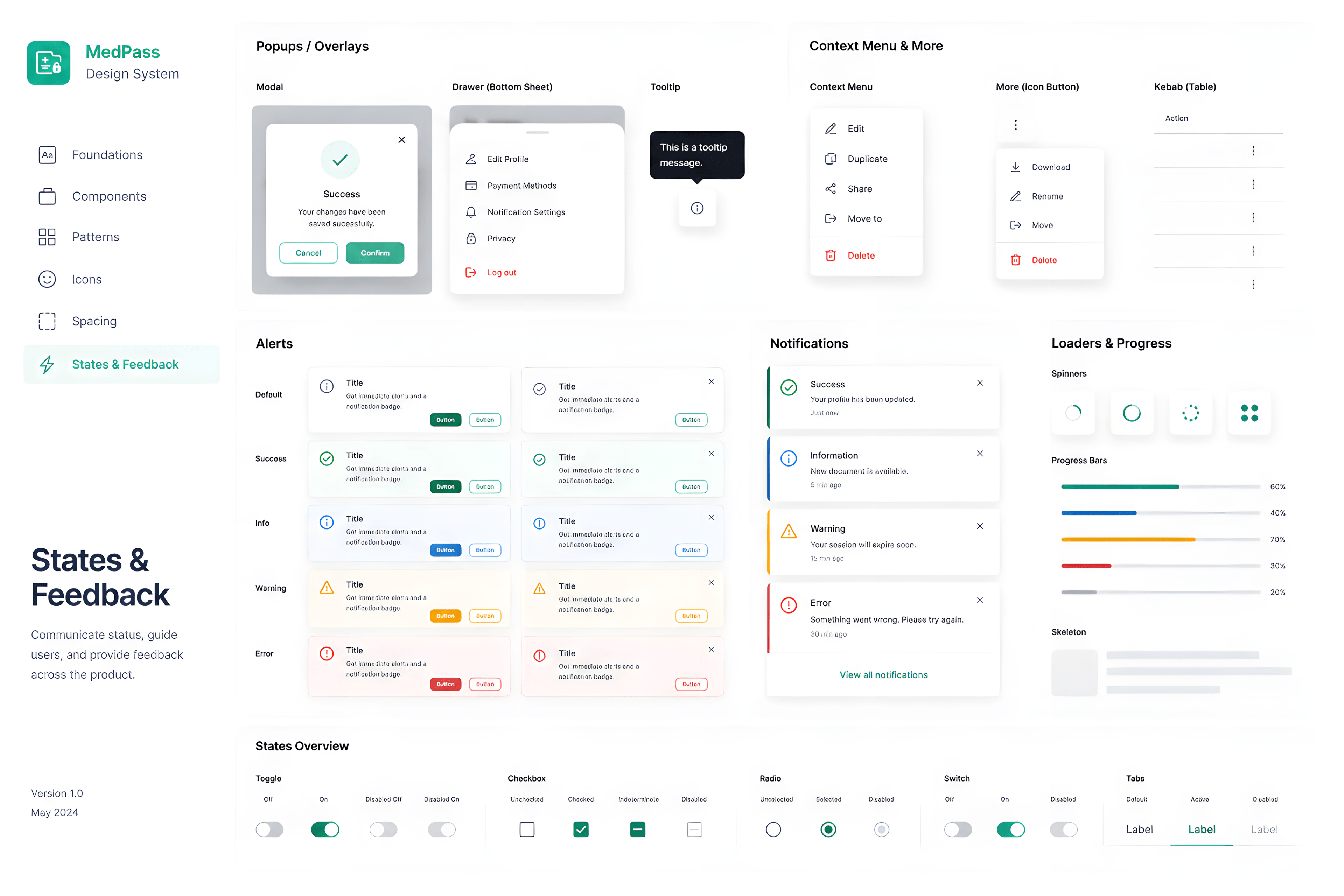
The design system defines the reusable language of the app: typography, colour scales, shadows, buttons, inputs, cards, navigation, pop-ups, feedback states, and progress elements. The focus is consistency and legibility for healthcare moments where users may be stressed, rushed, or checking sensitive information.
Interface mockups
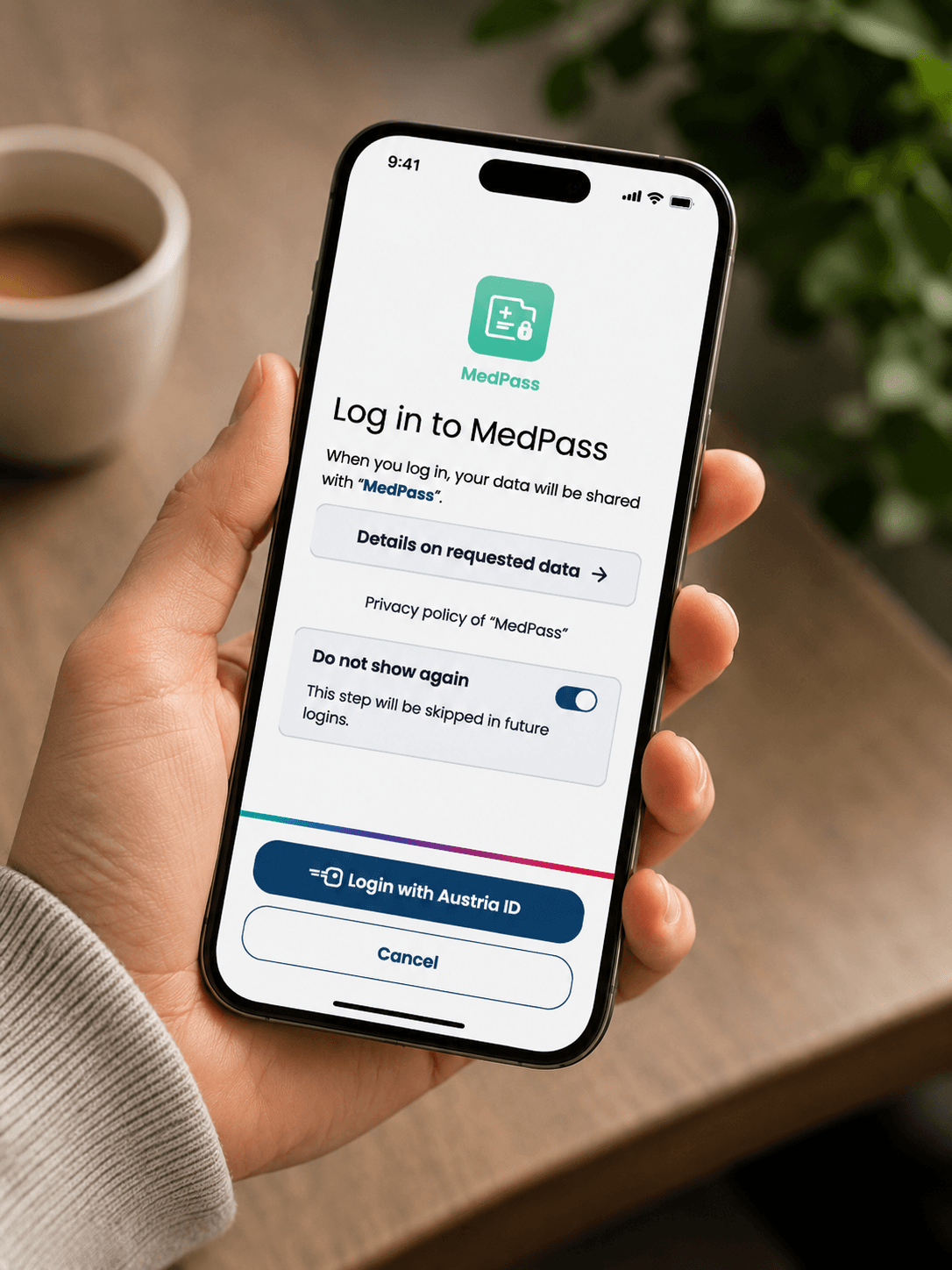
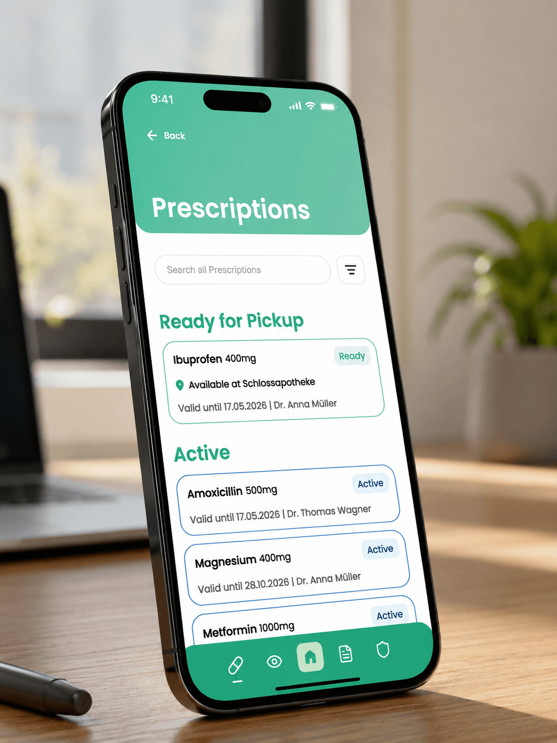
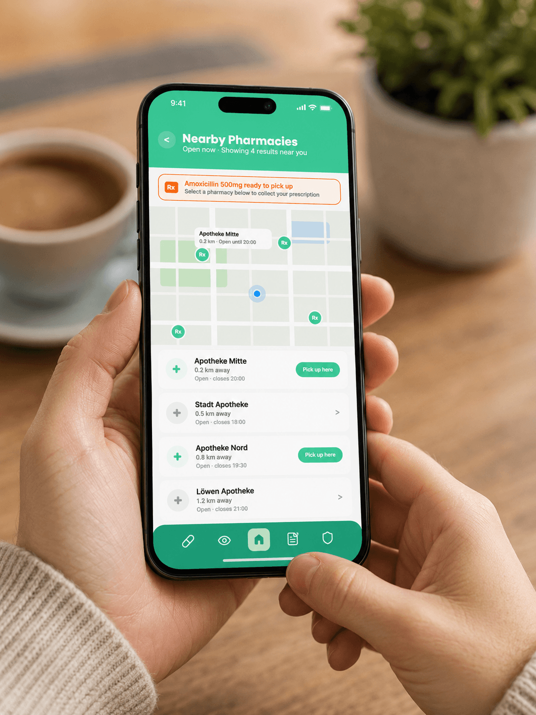
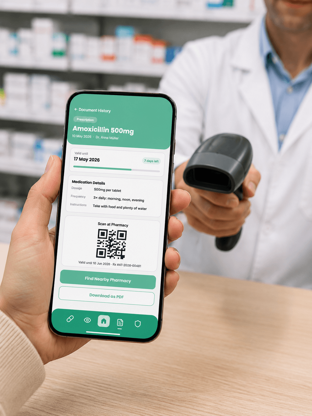
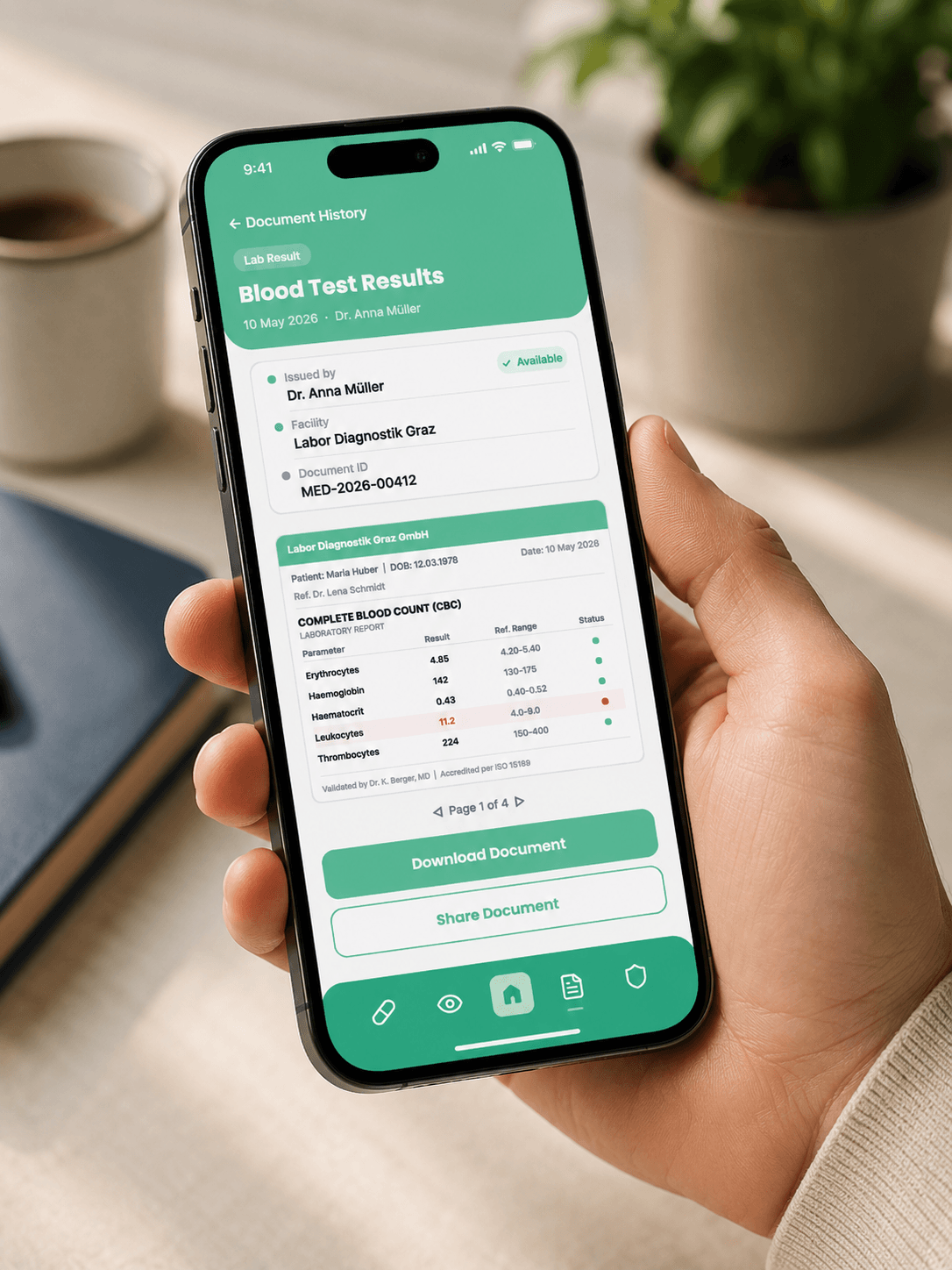
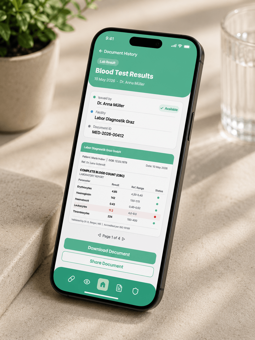
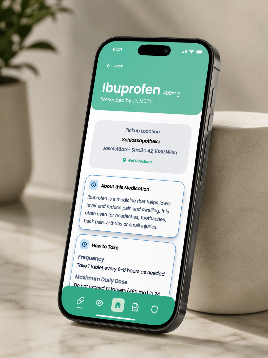
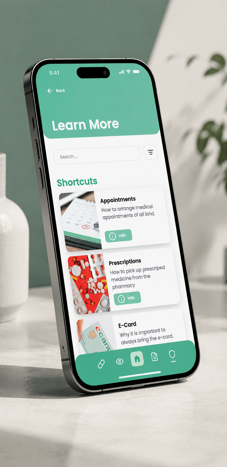
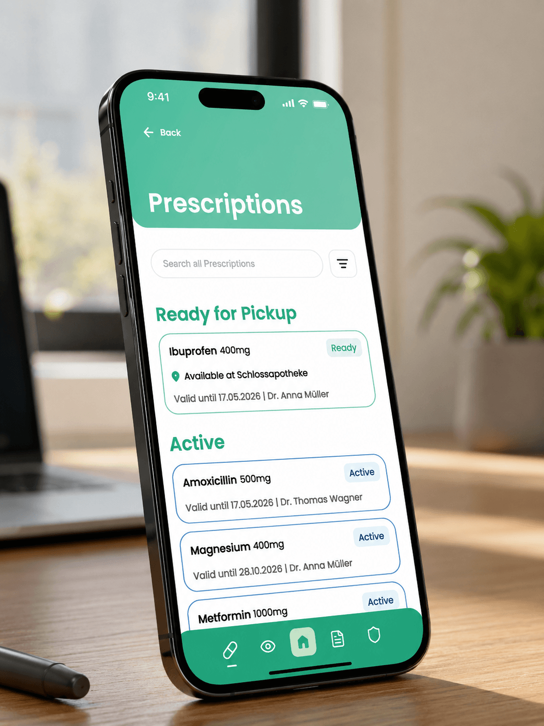
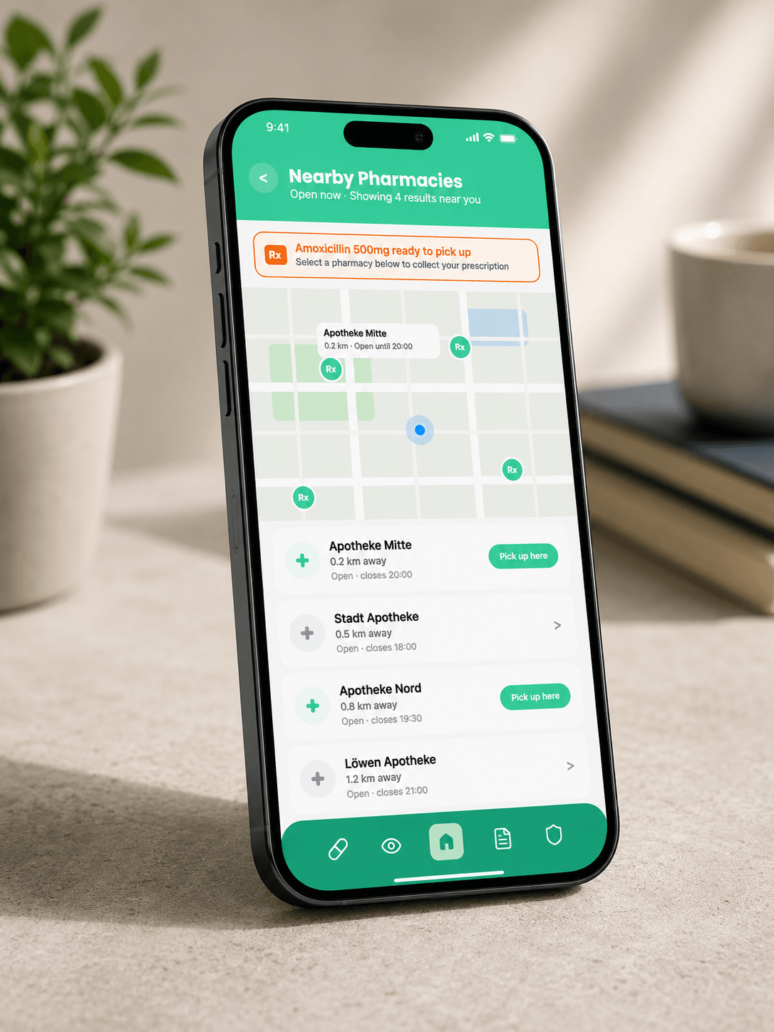
The mockups place the app in everyday healthcare contexts: checking prescription status at home, logging in through Austria ID, locating a pharmacy, reviewing lab results, and presenting a prescription for pickup. These scenes show the interface as something used in the middle of real tasks, not as isolated flat screens.