NO:118 Creative
Complete brand identity for a design agency I co-founded in Istanbul. Logo system, colour palette, typography, applications, and a full brandbook.
NO:118 Creative was a design agency I co-founded in Istanbul with a friend. We ran it for two years, taking on branding, print, and visual identity work, before I moved to Austria and we closed it. I was responsible for the complete visual identity: the logo, colour system, typography, brand applications, and a 53-page brandbook, built manually in Illustrator and Photoshop.
The mark
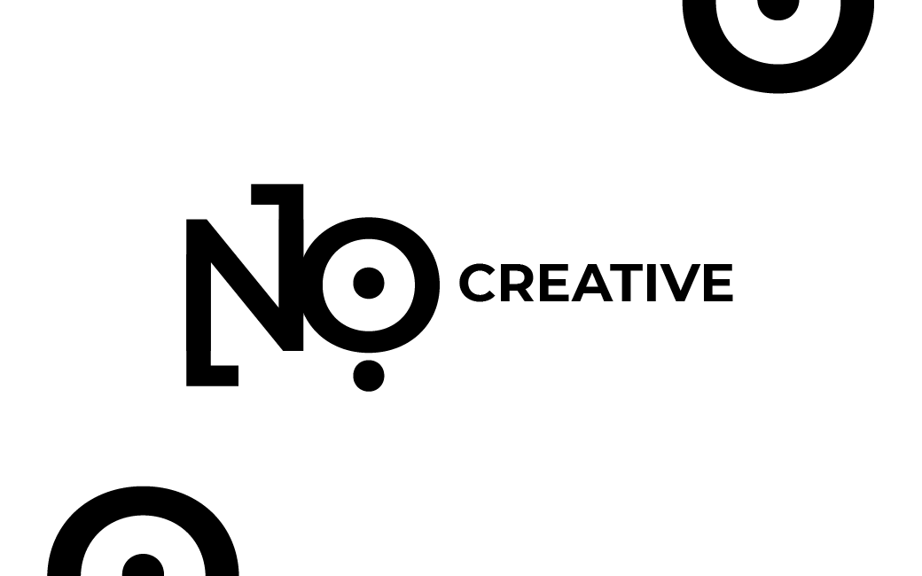
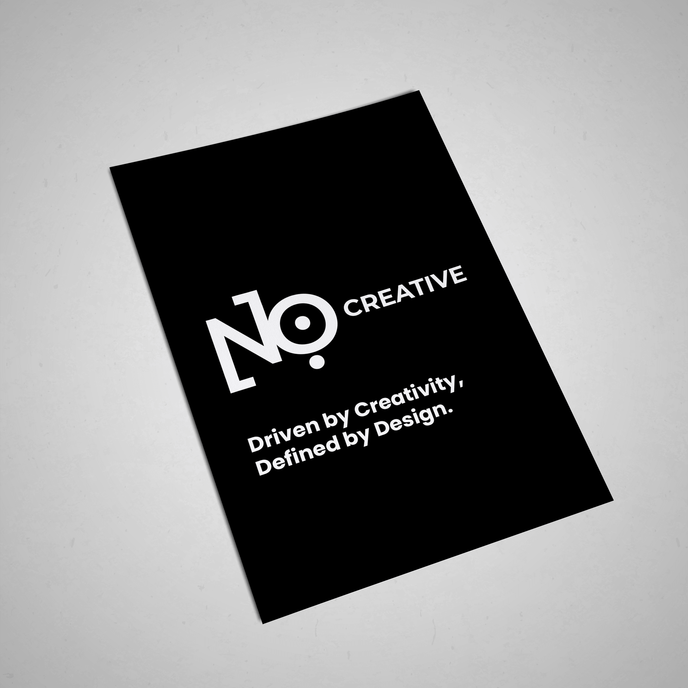
The name comes from the office address: No. 118, Kağıthane, Istanbul. But it also works as a provocation: a creative agency called 'No.' suggests refusal of convention and the confidence to challenge a brief. The logotype merges 'N' and 'o' into a single letterform. The O reads as both a letter and a bullseye: precision and focus. A bracket element on the left of the N creates the abbreviation feel of 'No.' The system is strictly monochromatic: the mark works at any scale, on any surface, in any colour combination.
Colour
The primary palette runs from near-black through a spectrum of forest greens to a vivid emerald. Secondary colours are a range of yellows from pale cream to saturated gold. The combination gives the agency a bold, contemporary character: energetic without being loud. The logo itself operates in pure black and white, keeping it versatile across any background colour.
Applications
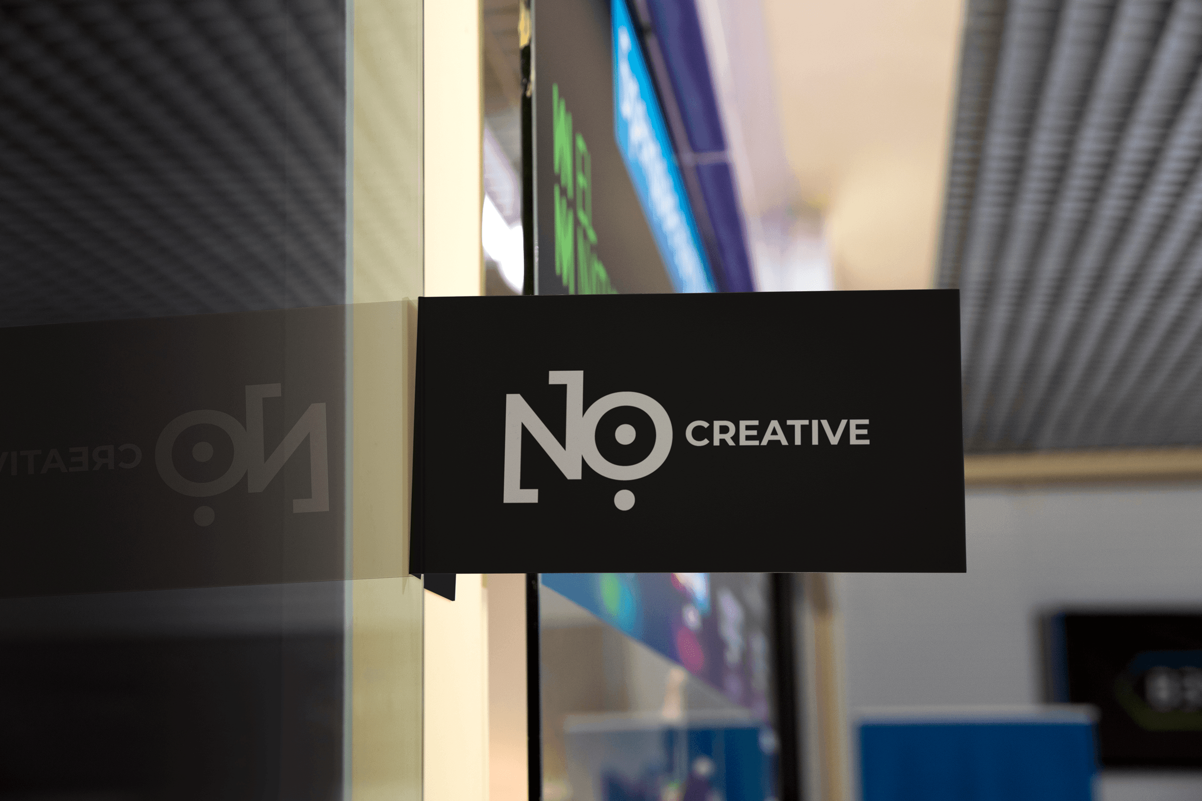
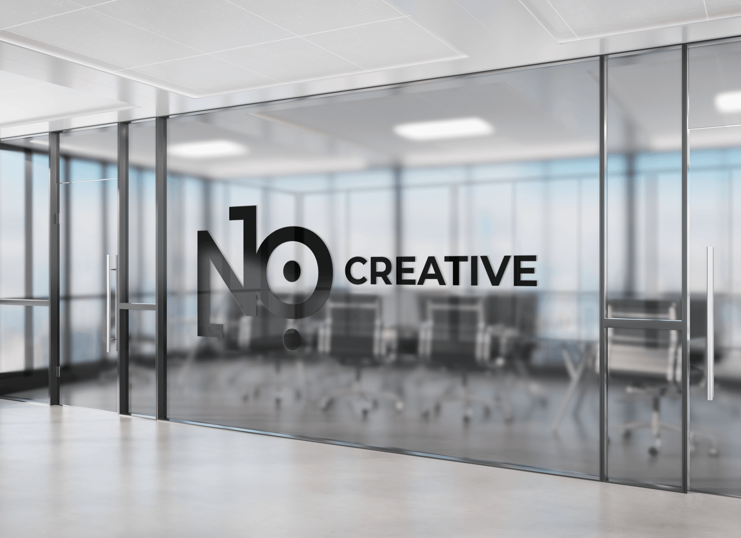
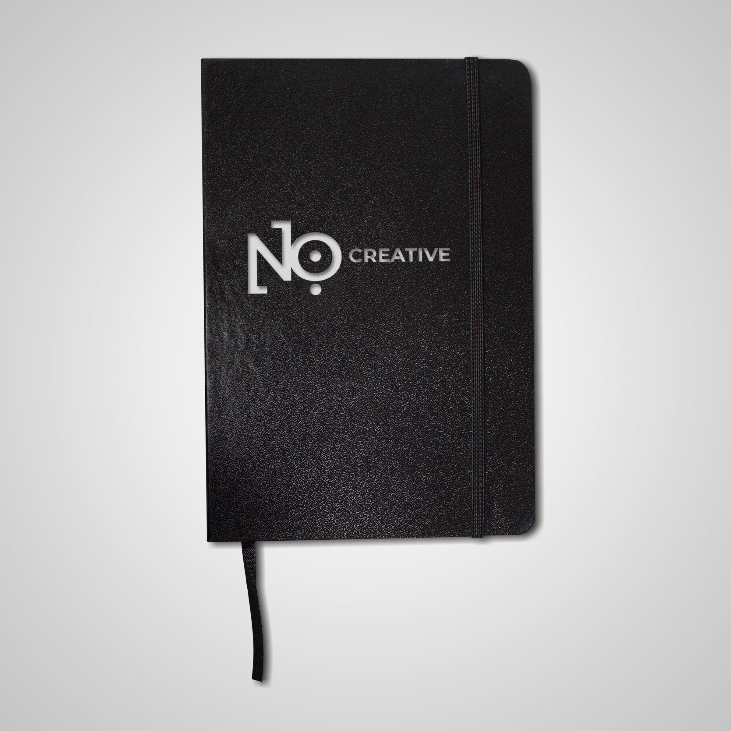
The identity was applied across business cards, print collateral, stationery, office signage, environmental graphics, and branded merchandise. The tagline 'Driven by Creativity, Defined by Design.' appears across print applications.
Brand book
The full brand book documents every element of the identity system: logo usage and construction, colour palette and guidelines, typography (Futura PT, Montserrat, Roboto, Playfair Display), brand voice and tone, target audience profiles, application rules, and operational guidelines. 52 pages. Scroll through below.