Boşluk: Magazine and Identity
A student magazine I co-founded and led as head of design. Identity system and editorial design across the first issue, 'Ses'.
Boşluk, the Turkish word for 'space' or 'void', is a student magazine I co-founded and led as head of design. The title points to the empty space the publication tries to fill: a platform for new voices that don't fit the conventions of existing university media. The design work covered both the identity system and the full editorial design of the first issue, themed 'Ses' ('Sound').
Identity
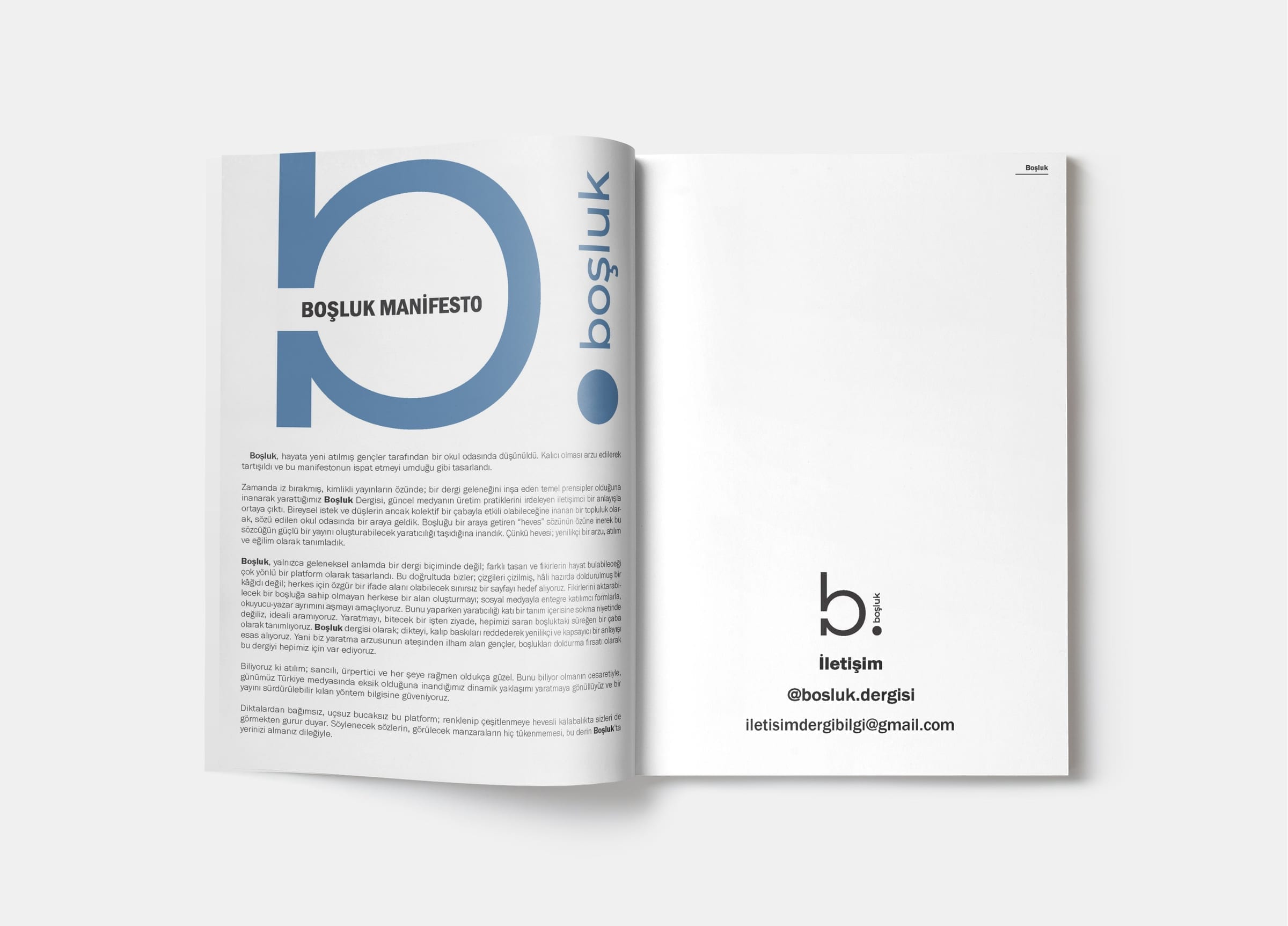
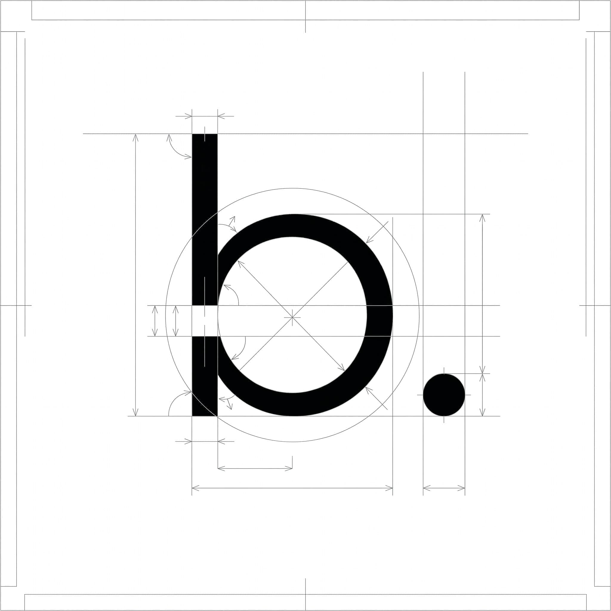
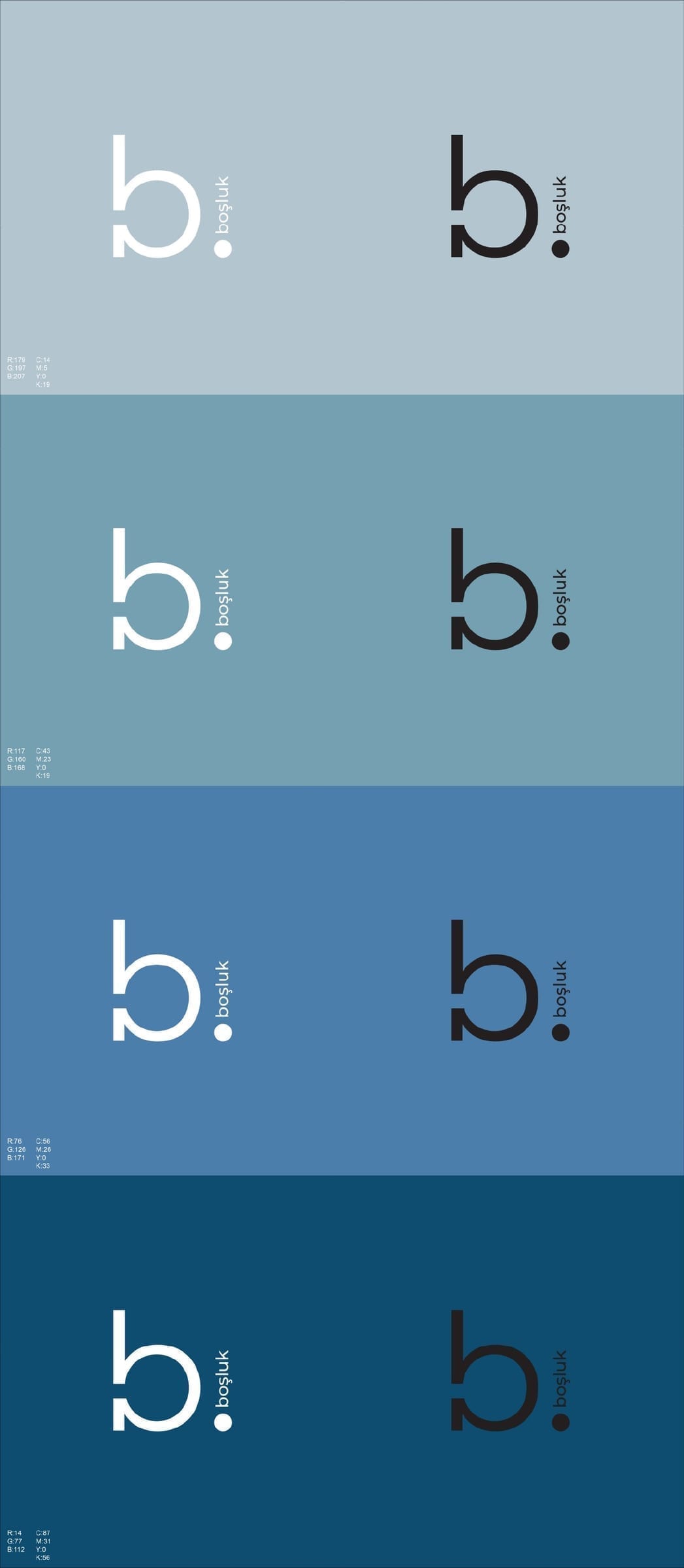
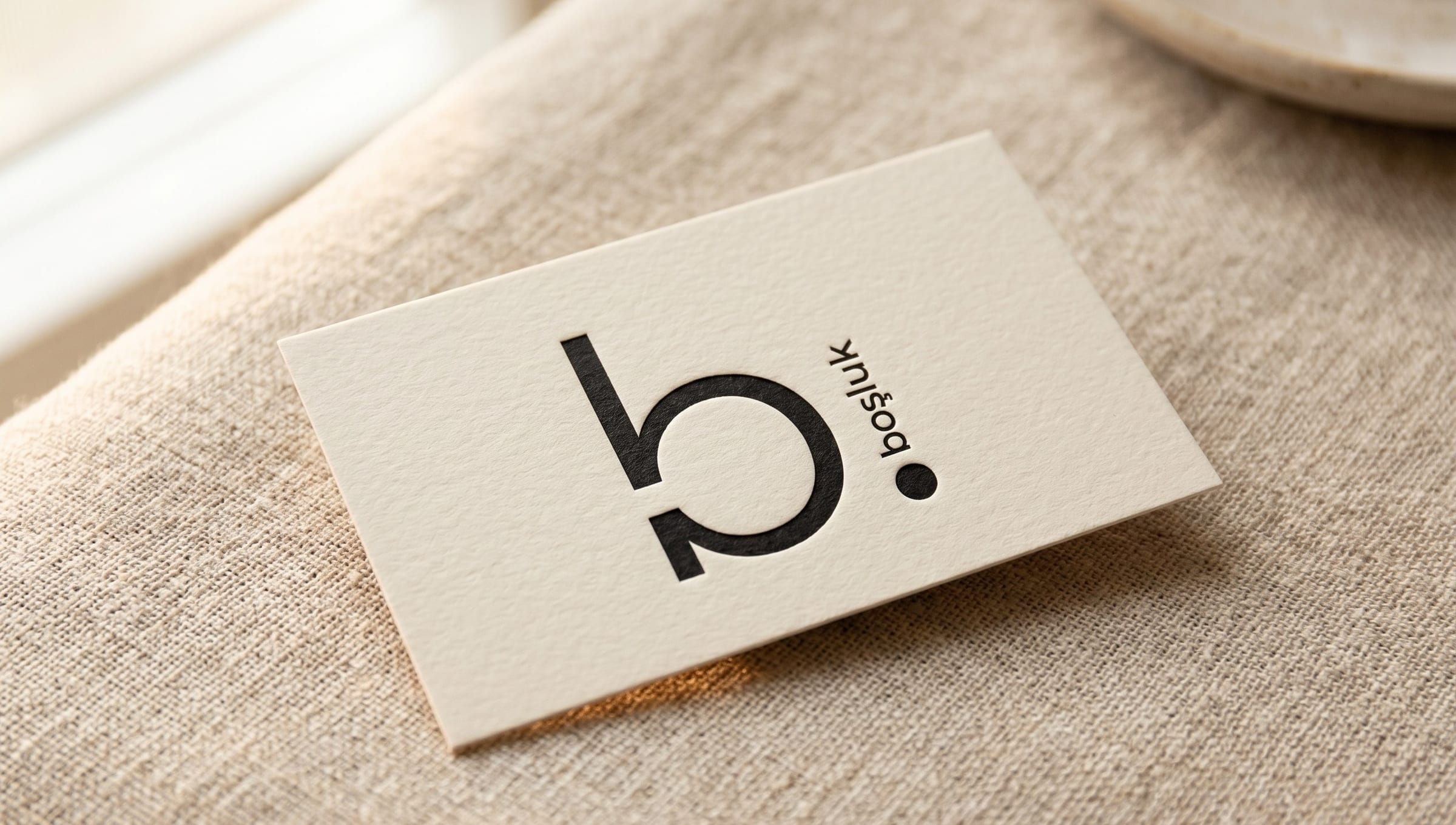
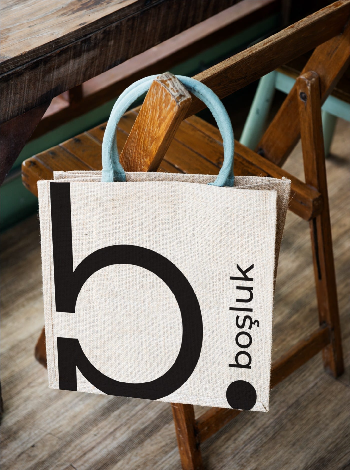
The wordmark is built from a lowercase 'b' followed by a filled circular dot, sized to match the counter of the letter. Read against the Turkish word, the mark reads as 'b.', a shorthand abbreviation that doubles as a visual nod to the Greek letter omega (Ω), signalling both an end and a beginning at once. The construction locks the two elements on a shared vertical axis with equal stem-to-counter ratios.

Colour
The identity uses a restrained palette: black and off-white as primary, with a family of blues running from pale sky to deep navy. Blue was chosen for its association with the cover concept of the first issue, sound waves, and for its editorial neutrality across article moods.
Applications
The Magazine: 'Ses'
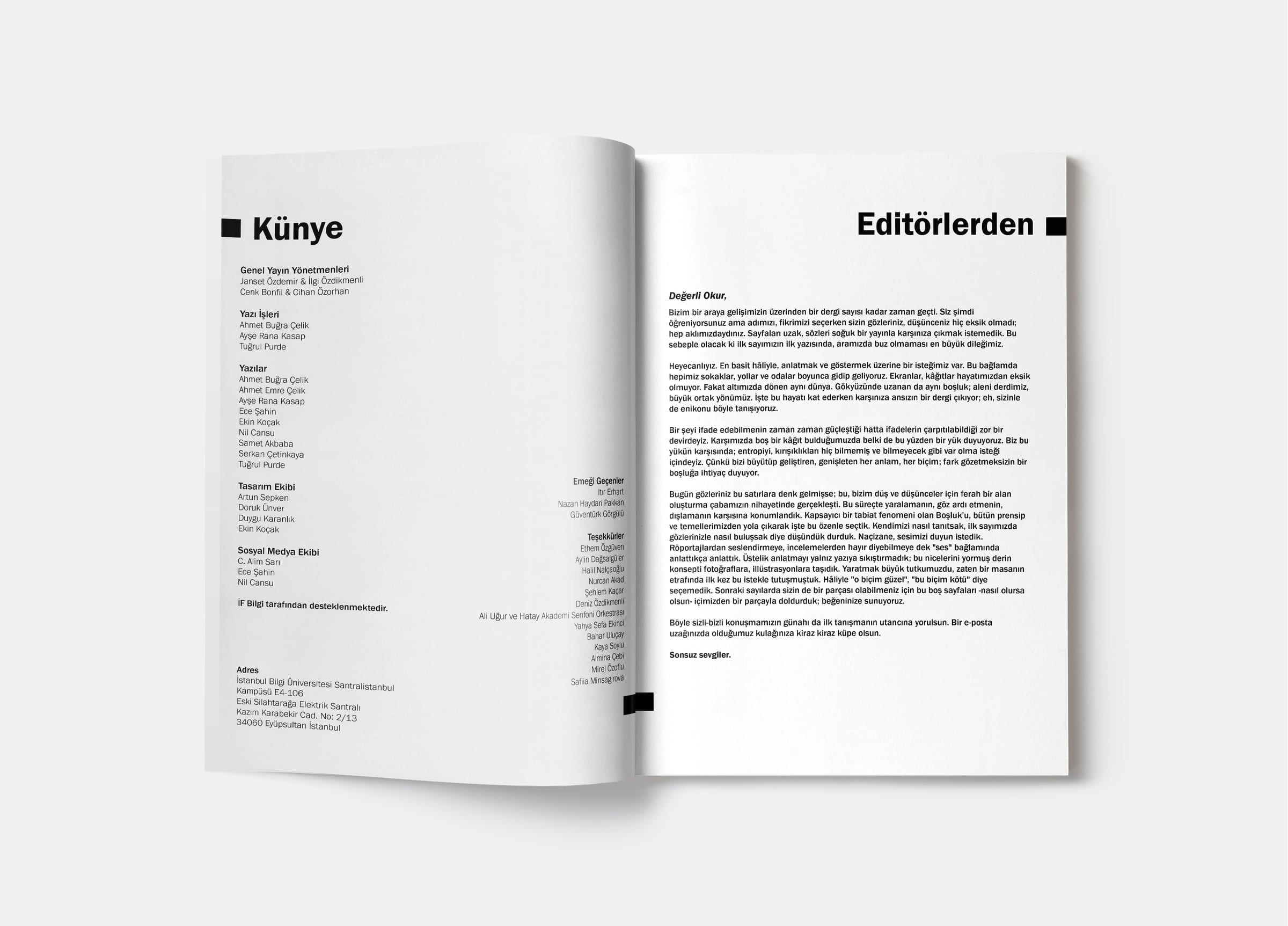
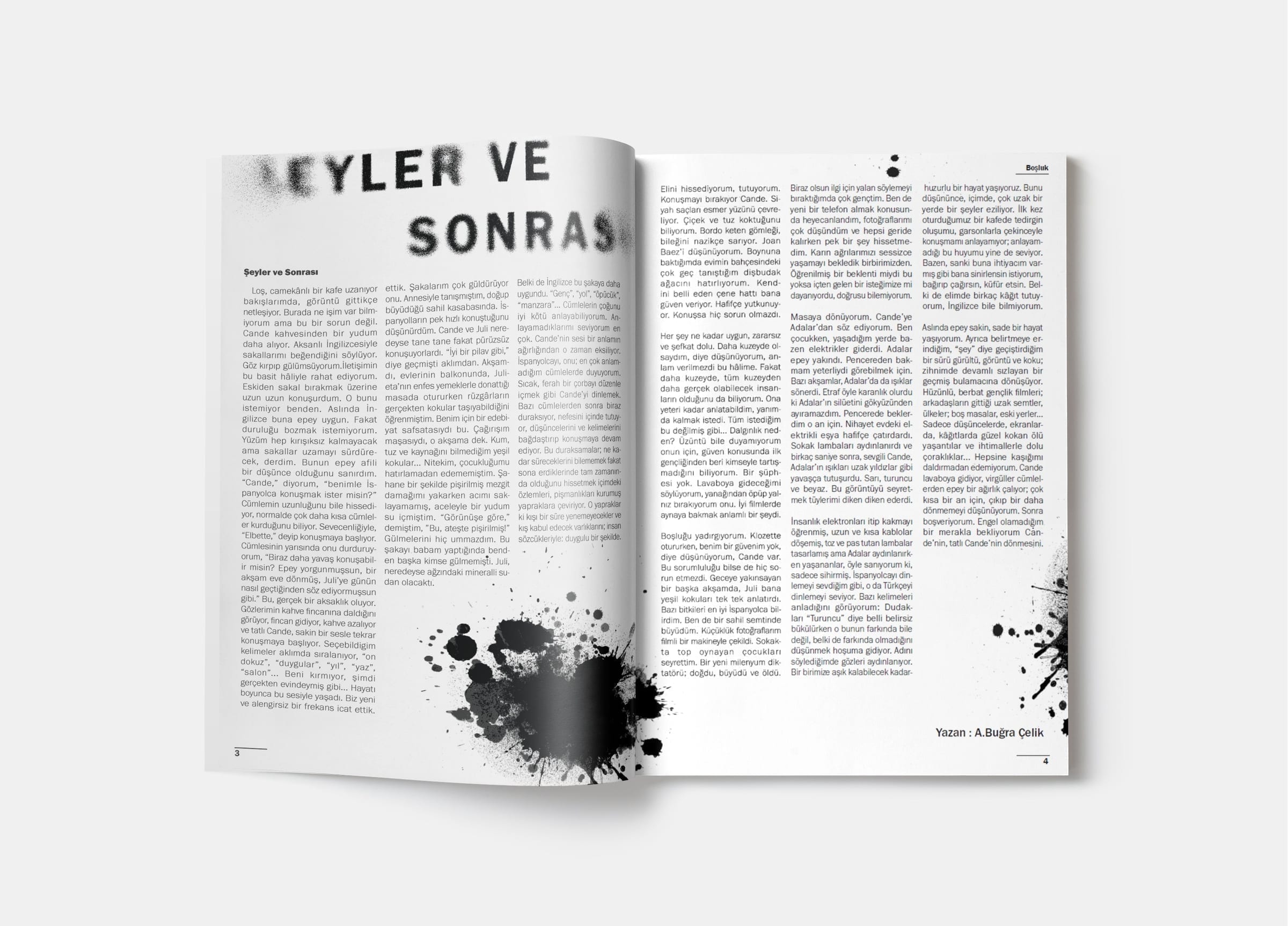
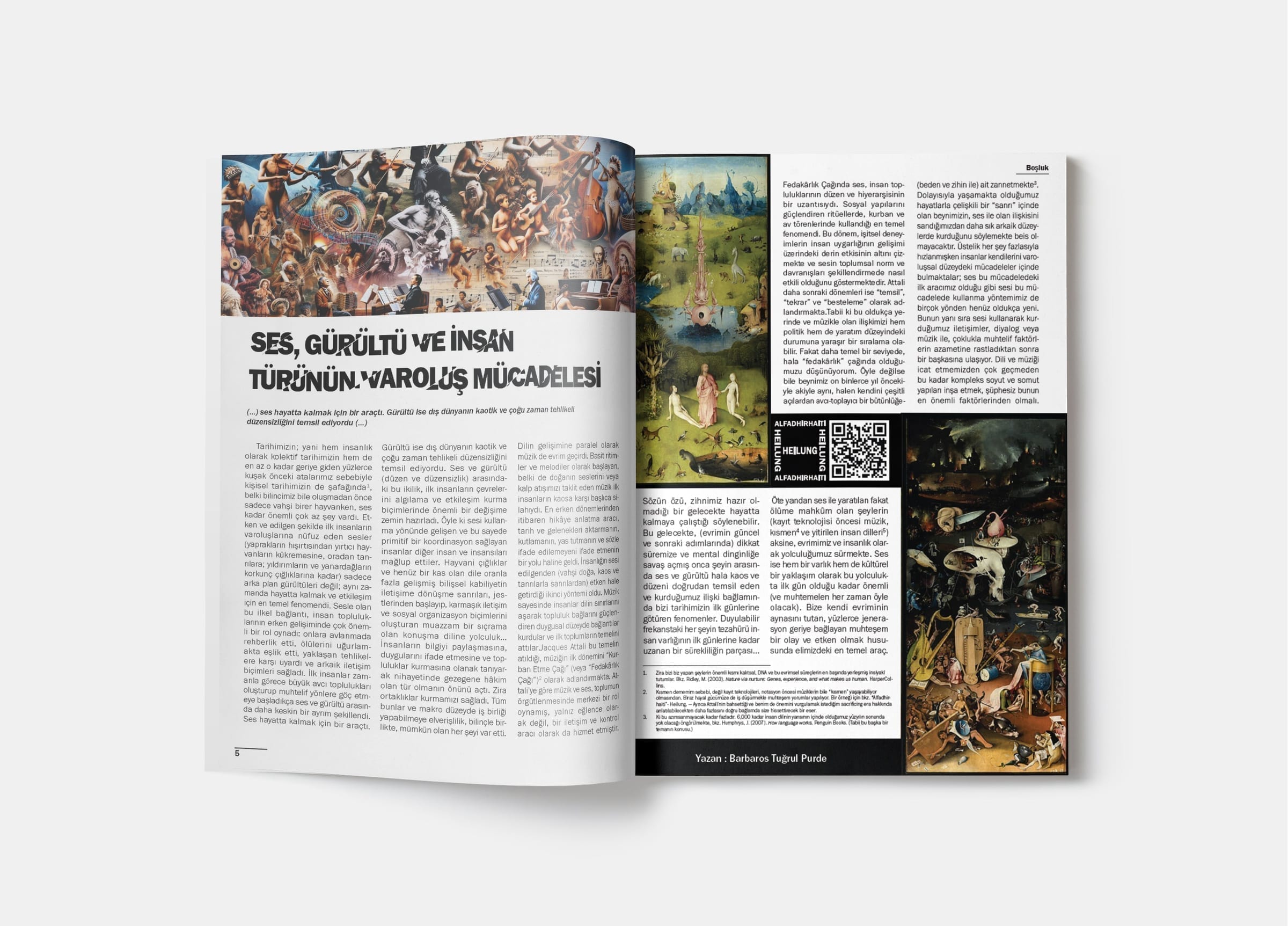
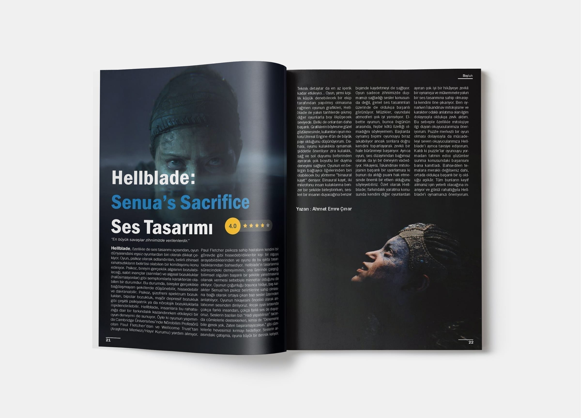
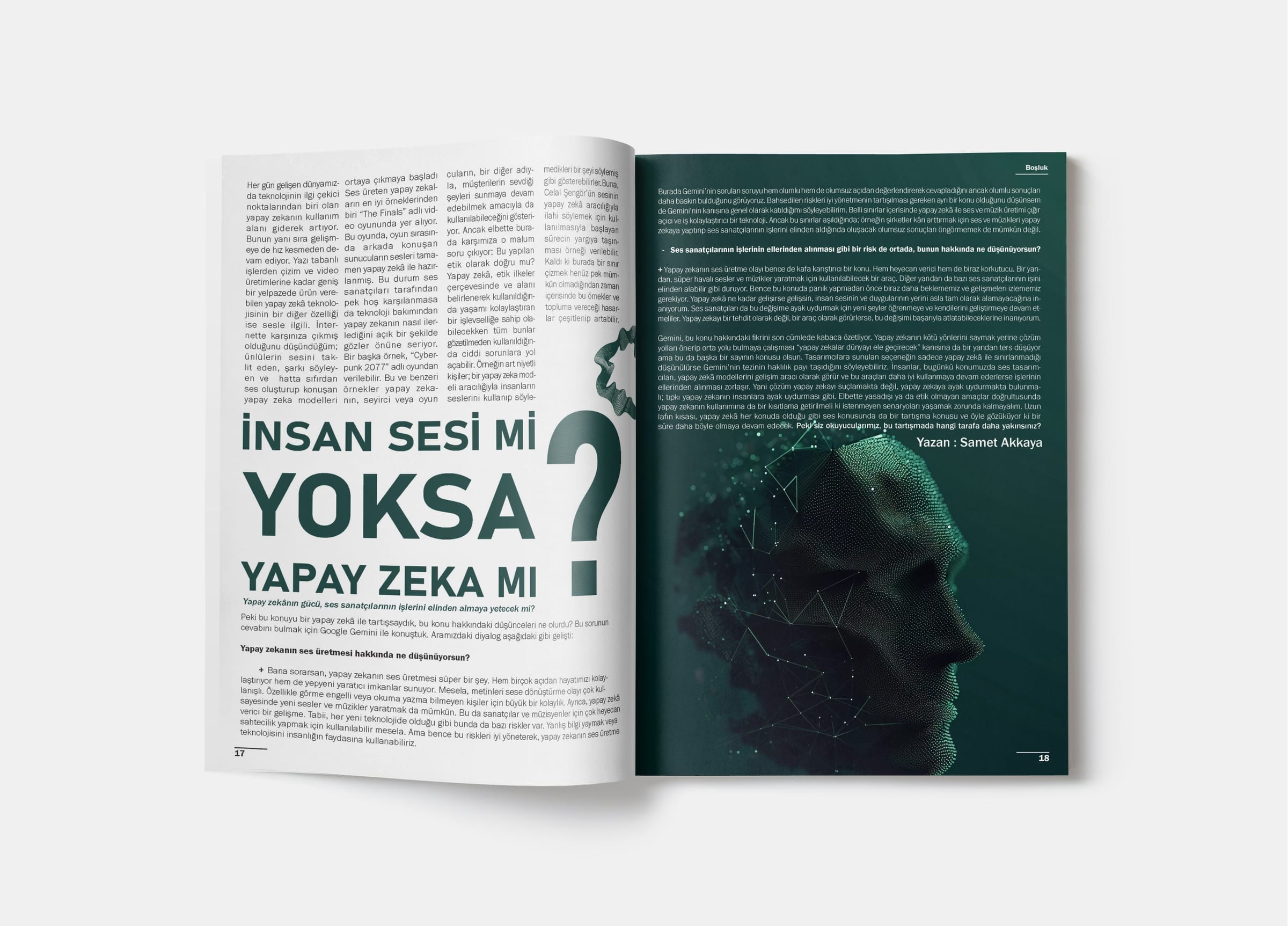
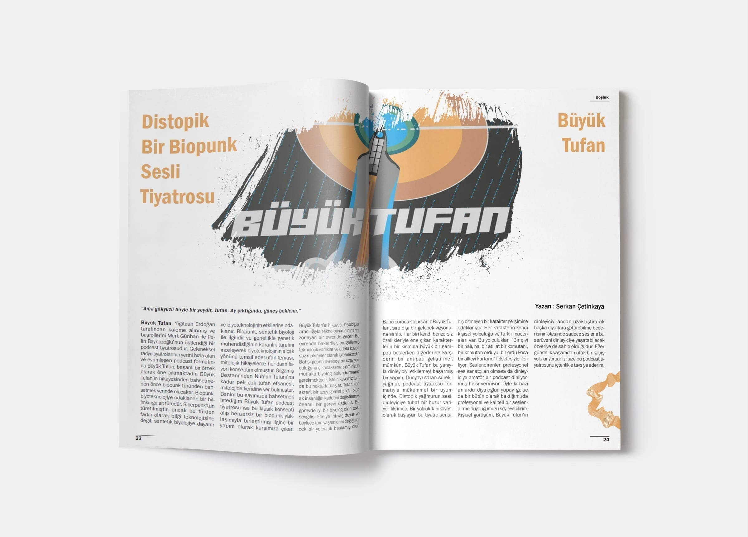
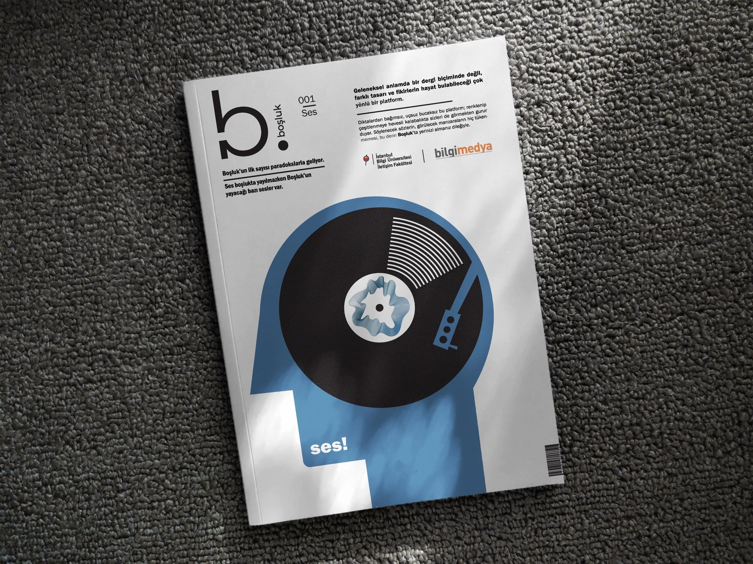
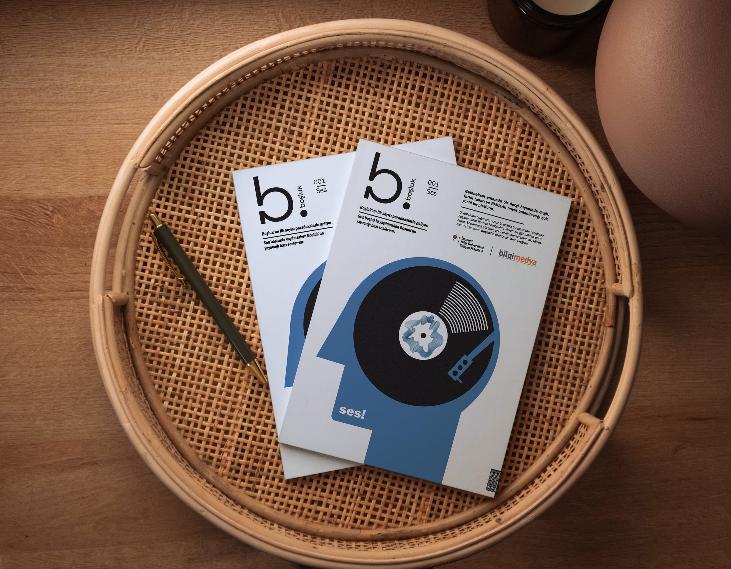
The first issue of Boşluk, 'Ses' ('Sound'), collects essays and features on voice, noise, music, and silence. The cover places a stylized human head in profile with a vinyl record for a mind, framed by the magazine's logo and a single word, 'ses!'. Inside, the layout stays editorial and restrained: a consistent typographic grid, generous white space, and photography treated as large-format inserts between text.
Spreads